Alex
Max
Casey
Justin
Brian
Dante
Alex
Max
Casey
Justin
Brian
Dante
Finishing Touches
We now have all the footage for the collaborative project. I’ve completed a draft of it – you can check it out below.
I’m really pleased with how this project turned out. Even without any color grading or correction done, the footage looks really good. We can make it look even better, though.
Your final project is to color grade this piece. You’ll find two versions of it in this Google Drive folder.
Both versions have the green screen segments already keyed out, so you just need to drop the background of your choice under the footage and do the color grade. I’d suggest using an adjustment layer with the green screen footage, so that you can affect both the foreground and background footage simultaneously.
When you are satisfied with your color work, export the video using the Vimeo 1080HD H.264 preset and email me the video file. You may need to upload it to your Google Drive and send me a download link.
Please have your finished work to me no later than midnight on Sunday, May 6. I’ll be in the studio during normal class hours on May 4, and most of the rest of that day, to provide feedback and assistance. As always, let me know if you have questions or need help with anything.
I can’t wait to see your finished films!
Things To Avoid
Courtesy of the fine folks at Aputure, here are five common mistakes made by beginning cinematographers.
Refining Your Style
You should now have a good overview of the tools available to you in Premiere Pro and the Lumetri Color panel. Before we wrap up the color grading section of the course, there are a few final techniques I want to touch on.
Mask Tracking
In an earlier lesson, I mentioned the masking tools that are available for Lumetri in the Effect Controls. You have access to a four-point mask, circular mask, and a pen tool that can be used to create a custom shape. These tools are helpful for when you want to correct or grade a specific part of the image, such as the sky. However, they only work well on static shots – unless you use a tracking mask.
Tracking masks follow a specific part of the image. If you wanted to add a specific color correction to an actor’s face, for example, you could draw a circular mask around their face and have the track mask follow it through the shot. Premiere makes this process easier by automatically tracking things in the frame as they move around.
After you create a mask, you should see Mask Path options above the controls for feather and opacity in the Effect Controls. There are icons for frame back, reverse play, forward play, and frame forward, plus a wrench icon for customizing settings: these are the tracking tools. You can leave the wrench icon alone – the default tracking values should be fine. If you click on the forward or reverse play icons, the program will automatically begin to track the footage forward or backward. If you are at the end of the clip, hit the track backward icon; and if you are at the beginning, hit track forward. If you create your mask in the middle of the clip, you will probably need to click one first, then the other.
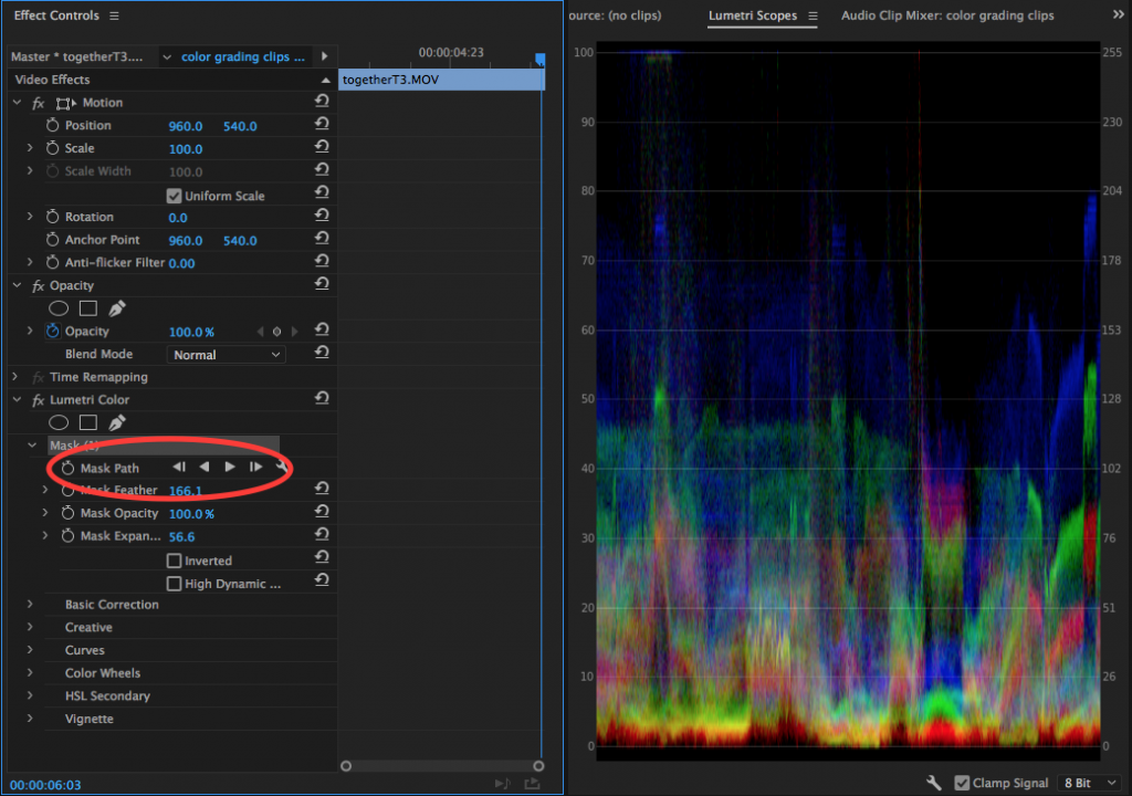
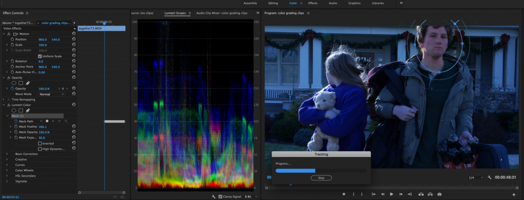
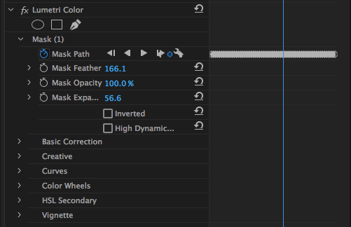
Hitting either play icon will cause Premiere to scan through the selected clip and create keyframes affecting the movement of the mask. Since it creates a new keyframe for every frame of the clip, this is often a slow process – and one that can be taxing on your computer. I’d recommend using mask tracking primarily on shorter clips without wildly changing movement. With these caveats aside, the automatic mask tracking really does do quite an impressive job of holding on to the area of the image you select with the mask. If the results aren’t quite what you wanted, you can always manipulate the keyframes by manually moving the mask.
Master Corrections
Most of the time, Lumetri is used to color grade shots in the timeline individually. If you want to affect multiple clips, you can either copy and paste the effect, create a preset or LUT, or use an adjustment layer. However, you also have the ability to affect a piece of footage every time it is used in your project. For example, if you have a long take that you use several clips of, you can make one adjustment to affect all of the clips. This is called a master adjustment.
At the very top of the Lumetri Color panel, above the Basic Correction section, you should see two pieces of text: “Master,” followed by an asterisk and the name of the clip; and the name of your timeline sequence, followed by an asterisk and the name of your clip. By default, the text with the name of your sequence will be highlighted in blue – this is the normal color grading mode that we have been using thus far. Clicking on the text with the word Master will switch you to that mode. Clicking on the down arrow will show the timecode of every section of the clip that has been used.
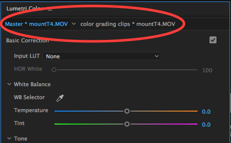
As I mentioned, the master adjustment will affect every instance of that piece of media. This makes it useful for things like basic corrections – if you need to change the white balance setting for the entire take, this would be a good way to do it. The master adjustment and the regular adjustments are totally separate as well, so you can make some settings universal and then continue to refine the look of your film on a shot-by-shot basis.
I honestly don’t use the master adjustments very often. Since Lumetri defaults to the non-master setting every time you click on a clip, it’s easy to forget that the master mode is even there. On larger projects with lots of sub-clips, however, it can be a great way to save yourself some work.
Obsolete Effects
For the past several years, Adobe has continued to add more and more functionality to the Lumetri Color panel with each successive version of Premiere. This has allowed editors to handle more of the color grading process directly within the software they are already using, without moving their projects to a different application. One side effect of this is that Adobe has largely ignored their own dedicated color grading software – SpeedGrade – and made several of the older color grading effects within Premiere obsolete.
However, those effects are still available – they just no longer appear in the Color Correction category. If you open the Effects panel and scroll down through the video effects, you’ll find a folder appropriately named “Obsolete,” which is comprised almost entirely of color-related options.
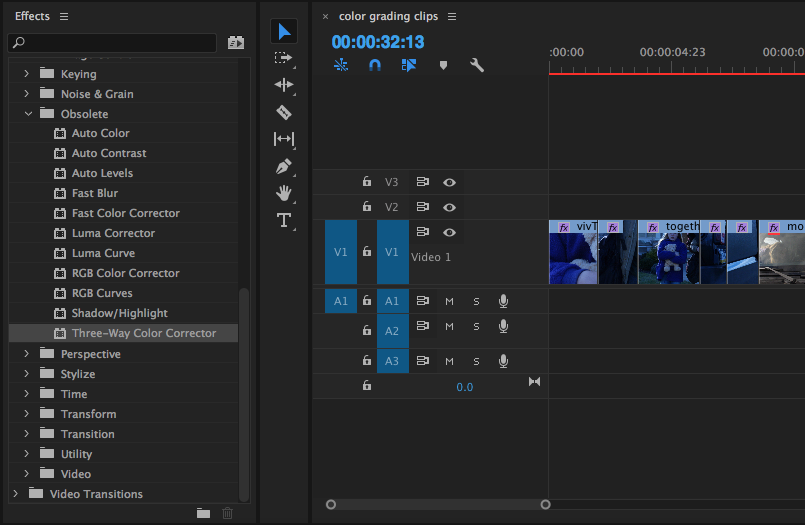
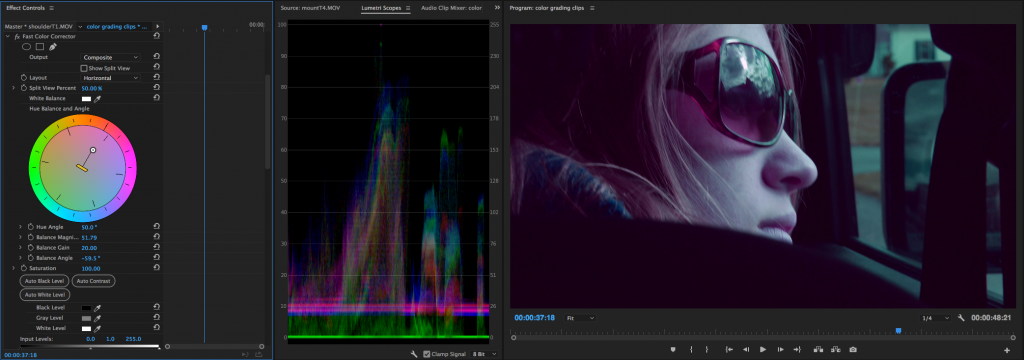
For a long time, I did all of my color correction and grading in Premiere using either the Three-Way Color Corrector, Fast Color Corrector, RGB Curves, or some combination thereof. These are still useful effects, but virtually all of their functionality has been replicated in Lumetri. The Fast Color Corrector is dominated by a large color wheel that can be used to alter the “hue balance and angle” of a shot. This can be a fun way to change the look of your footage. There are also lots of options related to luminance, so you can dial in the contrast, white levels, and black levels.
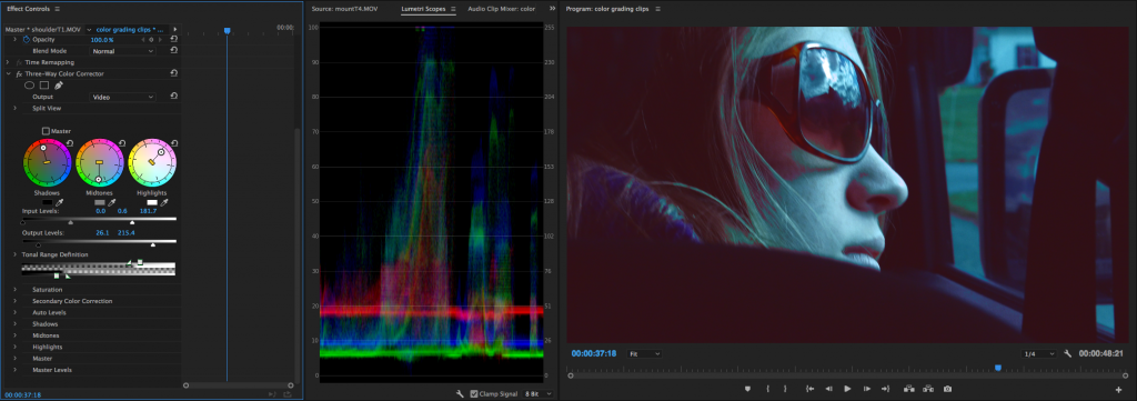
The Three-Way Color Corrector probably bears the closest resemblance to the Lumetri panel we now have. It has three color wheels, allowing you to adjust the shadows, midtones, and highlights separately. There are also sliders for saturation and luminance, as well as a “secondary” corrector for fine-tuning.
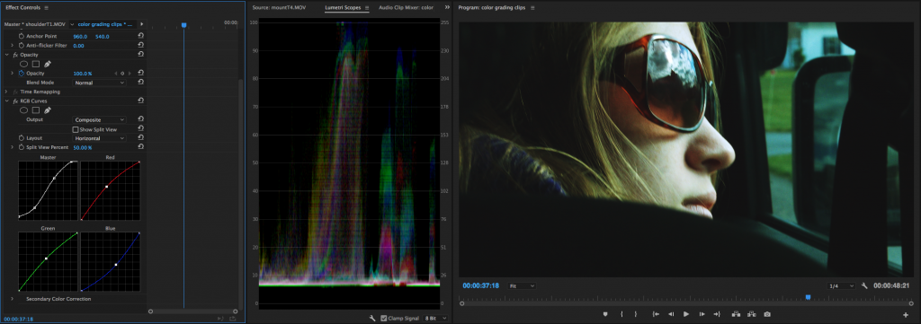
The RGB Curves effect is very simple, but that’s what I really like about it. It gives you separate graphs for luminance, red, green, and blue, which I actually prefer to the combined graph in Lumetri. Curves adjustments let you really play with the look of footage quickly – you can raise black levels, add contrast curves, and alter the overall color cast with just a few clicks.
Now that Lumetri Color has evolved into such a full-featured toolset, is it still worth using any of the obsolete effects? I actually think that it is. The “Hue Balance and Angle” wheel in Fast Color Corrector and Three-Way Color Corrector is a unique adjustment tool that can be fun to experiment with – and if you don’t need an entire suite of color grading options, the RGB Curves can be a simple way to make a quick adjustment. There are other simple effects in the obsolete folder as well, for things like highlight and shadow adjustments. Adding them as individual effects lets you customize not only what is applied, but the order in which they are applied.
There’s always more to learn, but at this point you should have a good set of techniques to build upon. If you need some inspiration, check out some of the videos in the Blog Posts section. Experiment and have fun!
The Award Goes To…
Want your film to look like it deserves an Oscar? In this tutorial, Jordy from Cinecom recreates shots from Darkest Hour, The Shape of Water, Blade Runner 2049, and Dunkirk. What I love about this video is that it goes through both the filming and color grading aspects of the process.
Very Complementary
Pushing your color grade towards the complementary colors teal and orange is very popular right now – either with the shadows going teal and the highlights going orange or with the shadows and highlights going teal and the midtones going orange. While the look is definitely trendy, it’s also a legitimately effective way to grade your footage, since it emphasizes the skin tones of your subject. Here are some explanations and guides to the teal and orange look.
This Post Has Been Flagged
Need a quick refresher on some of the tools for shaping light? The always-enthusiastic Jay P. Morgan of The Slanted Lens has a great video on how to use flags, silks, and nets to manipulate light.
To Log Or Not To Log
We talked in an earlier lesson about the pros and cons of filming with a “log” recording mode – a picture profile that decreases saturation and contrast to provide flexibility in post-production. I mentioned then that shooting in log was not always the best idea – it can introduce noise into low-light footage and make things like green screen compositing more difficult. Shooting log does have advantages, though – it can give you a degree of freedom in the color grading process that you simply don’t have if you are recording normally. It also makes it easier to correct issues like improper white balance, since the color saturation isn’t as intense. While I still hold that getting your footage right “in camera” is the best approach, knowing how to use log footage is an important skill. Often, that involves applying a LUT.
LUT stands for Look Up Table – it’s a small file that applies preset color grading values to a piece of footage. There are several kinds of LUT files, but the one you will probably encounter the most often is the .cube file. Because the LUT applies presets across a variety of parameters – contrast, saturation, color balance, and more – it’s important that the footage you start with be fairly neutral. Hence the importance of log color profiles. A LUT can certainly be applied to non-log footage, but the result will probably be footage that has been graded too severely.
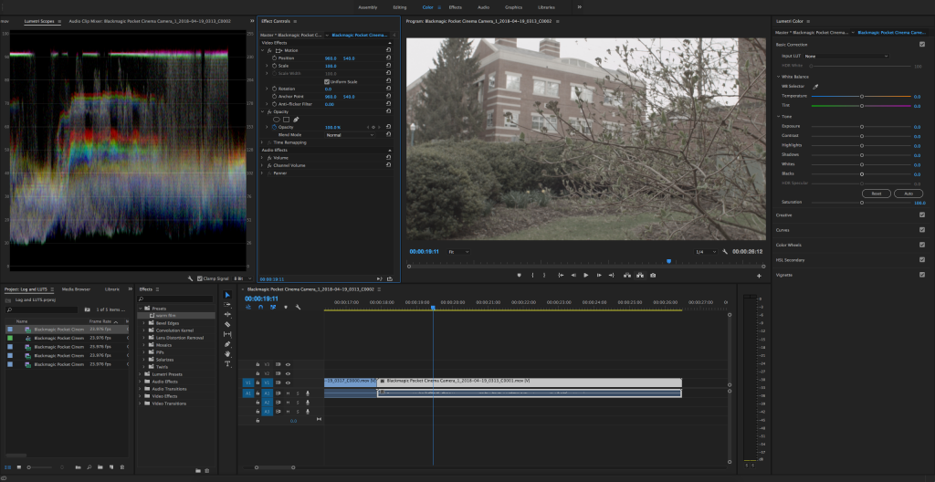
Also because of this, log footage is pretty bland and unattractive when you first import it. Colors – especially skin tones – are muted and grey. Because you are going to be grading log footage pretty aggressively, you want to be using footage that can stand up to a lot of manipulation. Footage captured at a high bitrate will do better, as will higher quality codecs, such as Apple ProRes and raw formats. Older cameras, such as our AF100 and GH3 models, capture footage with more compressed codecs and lower bitrates, so using a flat profile won’t work as well. The BlackMagic Pocket Cinema Camera and Sony FS5, on the other hand, have flat profiles built in and produce high quality (and larger) video files that can withstand aggressive grading.
Applying A LUT
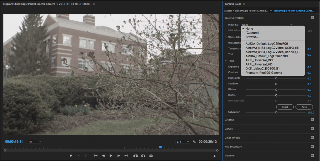
In Premiere, you can apply a LUT using the same Lumetri Color interface that we’ve been exploring over the last few weeks. At the very top of the panel, in the Basic Correction section, you’ll find the Input LUT dropdown menu. Premiere has a handful of LUTs built-in; these correspond to the formats of various cameras. The options are fairly limited, though.
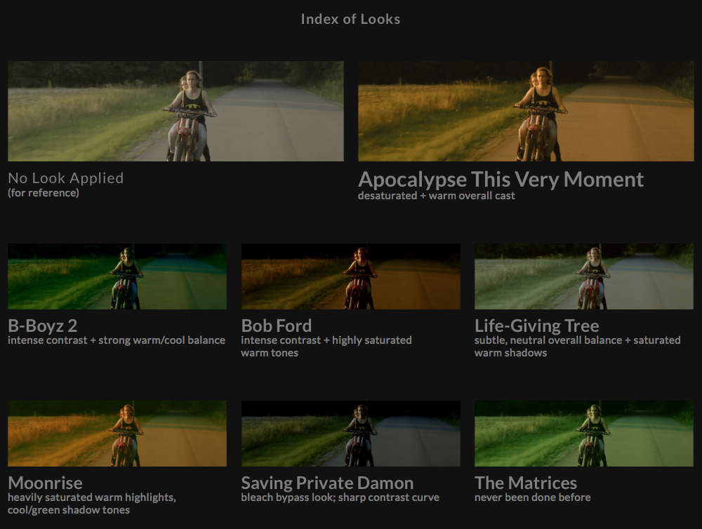
Fortunately, LUTs are pretty easy to find. If you do a quick internet search, you’ll find a ton of free options, as well as LUT packs for sale. Here’s a list of just a few places to download free LUTs, including great stylistic packs from RocketStock and SmallHD.
To apply a LUT to your footage, highlight it in the timeline and select Browse… from the Input LUT dropdown menu in the Lumetri Color panel. Select the appropriate file and your footage should immediately transform. Unfortunately, it’s impossible to tell what the effect of the LUT will be until you apply it, although sometimes reference images are provided by the developer.
After you apply the LUT, you’ll notice that none of the individual parameters within Lumetri have been changed. The LUT packages all of its adjustments together into one file. You can continue to tweak the overall look of the footage using the various parameters within Lumetri, but you cannot make adjustments to what the LUT itself is doing – it’s either applied or it isn’t.
LUTs can also be applied in the Creative section of the Lumetri Color effect. This allows you to make very basic corrections to your footage (such as white balance issues) before the LUT is applied. Just go to the Look dropdown menu and select Browse… to navigate to the file.
Make Your Own
You can also use Premiere to create your own LUTs, which can be very helpful when working on a larger project. To do so, make your adjustments as you normally would within the Lumetri Color panel. When you are satisfied with the look of the footage click on the “three lines” icon at the very top of the panel (next to the words Lumetri Color). Select Export .cube… and you’ll be asked to input a name and set a location for the LUT to be saved.
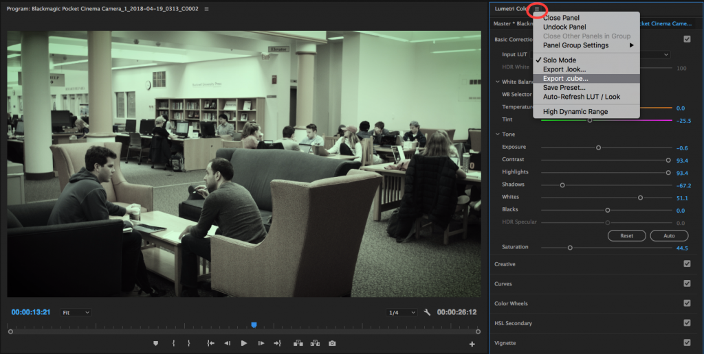
What’s cool about saving a .cube LUT in Premiere is that you can use that file to color grade footage on another machine – or even in another piece of color grading software, such as Final Cut Pro, After Effects, or DaVinci Resolve. Just bring the .cube file and you’ll be able to quickly apply the same look in whatever software you happen to be using.
LUTs Versus Presets
If you want to maintain the ability to make adjustments to the look by tweaking its individual parameters, you may want to save your grade as a Lumetri preset instead of a LUT. You do this in basically the same way as saving a LUT: click the icon at the top of the panel and choose Save Preset… from the options. You can also get to Save Preset… by right-clicking on the name of the Lumetri Color effect in the Effect Controls panel. A menu will pop up and you can enter a name and description for the preset. You can leave the other settings in the menu at their defaults.
The preset file won’t appear as a new file on your computer, like the LUT does – instead, it will show up in the Presets section of the Effects panel. To apply it, you can click and drag it from the menu, or double-click on it with the appropriate clip highlighted in the timeline.
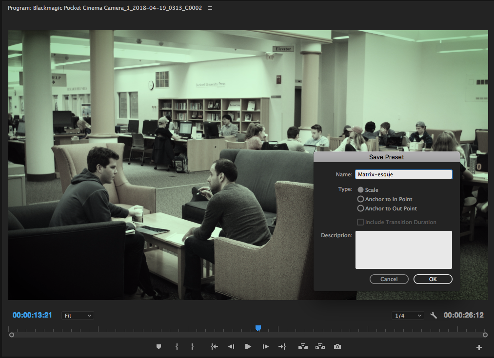
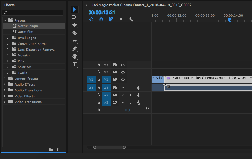
The downside of creating a preset instead of a LUT is that you won’t be able to bring that look into another color grading application (like Resolve). Since Lumetri is unique to Premiere, it will only function within that software. However, if you plan on only working in Premiere and want the ability to further adjust the various parameters of your grade, presets are a good option.
LUTs have become increasingly popular over the last few years. Many cameras and external monitors allow you to load a LUT onto the device and view a preview of what the footage will look like with it applied. This allows you to shoot in a flat picture profile, but still get an idea of what your graded footage will be like. LUTs aren’t always the best option, but they can be a fun and useful creative tool.
Make the Grade
As I mentioned in the previous lesson, I think of the coloring process in two stages: correction and grading. Correction involves fixing obvious problems with the footage, generally related to white balance and exposure. In Premiere Pro, most of this work can be done in the first section of the Lumetri Color panel, appropriately called Basic Correction.
This first stage of the coloring process is also where you can make adjustments to try to match the footage between two cameras. Every camera manufacturer interprets color in a slightly different way, which means that even if the white balance is set to the same value, footage from a Canon and footage from a Sony will look a bit different. You can use the scopes to help determine these differences and they can generally be resolved using the White Balance adjustment sliders. Again, pay particular attention to skin tones, the sky, and white areas of the image – they will be the obvious indicators of problems.
With your footage corrected, you can move on to the aesthetic aspect of the color process: grading. Let’s work our way through the rest of the Lumetri panel to see what we can do.
Creative
The Creative section of Lumetri Color gives you a handful of tools that can very quickly transform the overall style of your footage. At the top of the section, you’ll find the Look options, composed of a dropdown menu, preview window, and Intensity slider. The options in Look are presets, several of which are designed to emulate different film stocks. If you click through the arrows on the preview window, you’ll see the effect they have on the image. If you click on the preview image, it will be applied to the highlighted clip in the timeline.
Many of the preset looks are a little on the extreme side when you first apply them, so you can dial them back (or up) using the Intensity slider. If you don’t want to spend a lot of time color grading, the looks are a great option. You can also further refine them by adjusting the rest of the parameters in Lumetri. However, if you really want to control the look of your footage precisely, you should probably skip the Look section and make your adjustments manually.
Incidentally, to remove a look from your clip, go to the dropdown menu and select None. For all other adjustments in Lumetri, you can reset by double clicking on them.

Below Look is the Adjustments section. Faded Film raises the black levels to create a vintage film look. Sharpen adds digital sharpening, which can help if your focus is a little soft. However, over-sharpened footage starts to look weird very quickly, so use a light touch. Vibrance and Saturation affect the intensity of colors. Saturation affects all of the colors in the shot while vibrance increases the value of more muted colors. Vibrance can be useful if you want to increase the amount of color without making things like skin tones look unnatural.
The last options in the Adjustments are related to shadow and highlight tint. We’ve talked before about the popular “orange and teal” look and this is one place where you can push things in that direction. After you apply an adjustment to the shadows and highlights using the color wheels, you can push the image towards one or the other using the Tint Balance slider.
Curves
The Curves section of Lumetri is dedicated to making adjustments to color levels and is composed of two tools: a traditional diagonal RGB curves graph and a hue saturation color wheel. In the RGB Curves section, you can choose the red, green, or blue channels, as well as the overall exposure by clicking on the colored dots. You can then click on the diagonal line to create points and make adjustments. The top right corner is pure white and the bottom left corner is pure black, so you can adjust the highlights, shadows, and mid areas fairly precisely. Use an “S” curve to create contrast (brighter highlights and darker shadows) or a reverse “S” to lower contrast. Little curves adjustments go a long way.

The Hue Saturation Curves section lets you target the saturation levels of very specific colors. You can click on the white line to add points or click on the colored dots below the wheel to have the program add them around certain values. Dragging points towards the center of the wheel will desaturate those areas and dragging towards the outside edge will add saturation. You can use this wheel to add or remove color areas fairly precisely.

Color Wheels
The Color Wheels section is the most like a traditional color grading interface, where there are separate wheel controls for the shadows, midtones, and highlights. These are fun color wheels to play with; try pulling your highlights and shadows in the opposite direction for a complementary color grade or pull everything towards the same value for something more analogous (remember your color theory?). The sliders next to each wheel adjust the luminance, so if you want to raise or crush the blacks or accentuate the highlights, you can further tweak those values in this section. I’ve said this before, but a little goes a long way with these adjustments – just a slight push can really transform your footage, so don’t feel like you need to go nuts.
Here’s the same shot, first with the oh-so-trendy orange/blue complementary split (with milky raised blacks for a filmic look), then with a green/teal analogous and contrasty Matrix-esque grade:


HSL Secondary
The HSL Secondary section contains a lot of options and it can look overwhelming at first; it could probably stand alone as its own separate effect. Once you understand what it does, however, there are some very cool possibilities. HSL Secondary targets very specific parts of your image, based on hue, saturation, and luminance (HSL).
With this section, you need to start at the top and work your way down. In the Key area, you can use preset color dots, the eyedropper tools, or the individual HSL bars to choose which area of your image you would like to affect. I’d suggest either the dots or the eyedropper. To see which area you have selected, click on the box next to the Color/Grey dropdown menu – it will grey out everything not selected and show the selected area in color. You can refine your selection a bit with he Denoise and Blur sliders, but these can also give you a weird “mushy” selection if you use them too much. Clicking on the icon next to the Color/Grey menu will invert your selection, which can be handy.
Once you have a specific area selected, you can adjust the color using either a single or triple color wheel (there are two small icons directly below Correction to choose between them), and refine the temperature, tint, contrast, sharpening, and saturation. These options all work the same way they did in the Basic Correction section, only on a targeted area of the image.
In the example below, I was able to bring more saturation into only the green areas of the image, making the grass and bushes in the shot more prominent, without affecting the rest of the image. That’s a pretty simple example of what HSL Secondary can do, but you could use it in all sorts of creative ways to highlight different aspects of a shot.


Vignette
Vignettes draw the eye to the center of the frame and are generally aesthetically pleasing. Feel free to use them, but (again) don’t overuse them or your footage will look like it has a cheesy filter on it. The options in the Vignette section are pretty straightforward: dragging Amount into a negative value will add a dark vignette, while a positive number will add a light vignette; the midpoint changes the overall size; roundness changes the effect from an oval to a circular shape; and feather controls the fall off. If you are having a hard time seeing what effect the vignette is making, try turning the Feather slider down to zero.
Light vignettes are sort of unusual; I usually use a value between -.2 and -.8 in the Amount slider.

Masks
If you want to only use Lumetri Color on a certain section of the image, you can do so using a mask. The masking tools in Premiere aren’t as advanced as those you might find in something like After Effects, but they will do the job for simple tasks. You won’t find mask options in the Lumetri Color panel itself; instead, look in the Effect Controls panel. Under the name of the effect, you should find options for a circular mask, a rectangular mask, and a custom mask using the pen tool. clicking on one of these options will add the mask and create additional control parameters in the effect.

The mask can be resized in the Program monitor by clicking and dragging on its key points and you can adjust its feather either in the Program monitor or in the Effect Controls panel. You can even animate the shape of the mask by turning on the Mask Path keyframes – although, again, these controls are fairly limited.
Adjustment Layers
On the opposite end of the spectrum, you can use Lumetri on multiple clips at once by applying it to an adjustment layer. Adjustment layers can be resized over any length of the timeline and will affect any clips beneath them. To create one, click on the New Item icon in the Project panel (it looks like a box with one turned-up corner) and choose Adjustment Layer. It will be dropped into the Project panel (not the timeline), so you’ll need to drag it into your sequence and resize it as necessary. To add Lumetri to it, highlight the adjustment layer and either choose Lumetri Color from the list of effects or make an adjustment in the Lumetri Color panel. Adjustment layers are a great way to add things like vignettes to an entire project or section of a film.

Between the various options in the Lumetri Color panel, you have a very capable and adaptable toolset for altering the color of your film. Take some time to play around with the various options – like a lot of these techniques, the best way to get a handle on it is to just start experimenting. Occasionally, you may find it helpful to switch the visibility of the effect off in the Effect Controls, just to see how far your footage has come.
Red, Green, and Blue
All color film and video is made up of the combination of three colors: red, green, and blue. Color correction and grading is the act of altering the relationship between those three colors. Until fairly recently, when color grading was a chemical process, film negatives were exposed to different chemicals to change the amount of red, green, and blue in a sequence. Strips of film were placed into chemical baths for a very specific amount of time to do this, which is why color grading was once also called “color timing.”
Color grading, color correction, and even color timing are still used as largely interchangeable terms. However, I’d like to draw a distinction between correction and grading. When I refer to color correction, I’m talking about the initial “fix it” stage of the color manipulation process. Color correction largely involves making changes to a shot’s overall brightness, raising or lowering the shadows and highlights, and compensating for white balance issues. I think of color grading as the stage where you add a distinctive style to a piece. Grading is the stage where you dial in the film’s “look” – you might crush the blacks, or warm up the highlights, add a vignette, or make other aesthetic choices.
In order to get to the color grading stage, you have to start with the color correction stage. It’s important that you start with a “blank canvas.” Today, we’ll be focusing on the correction process.
Software Options
We’ll be using the color correction and grading tools in Adobe Premiere Pro over the next few weeks. Adobe also has a dedicated color grading program called SpeedGrade, which offers a lot of fine control and advanced features. However, Adobe hasn’t updated SpeedGrade since the 2015 version. Instead, they’ve migrated many of the features – and some new ones – into Premiere, making it a more viable all-in-one option for editing and color work.
Despite the lack of updates, SpeedGrade is still a solid piece of software and a good option for color correction and grading. DaVinci Resolve is another popular options; DaVinci has approached the issue from the opposite direction as Adobe, by starting with dedicated color software and adding more and more editing functionality to it. Some editors have switched from Premiere to Resolve because of its stability and advanced color features. There’s even a free version of the software called Resolve Studio. Final Cut Pro X has its own set of color tools, some of which are quite good. Like a lot of the features in Final Cut, however, a lot of the process has been streamlined and automated.
Scopes
If you’ve spent some time using Premiere, you may be aware of the different workspace configurations it offers. Along the top of the program, you should see options including Assembly, Editing, Color, Effects, Audio, and more. These can also be found in the Workspaces section of the Window dropdown menu at the top of the screen. Like most Adobe programs, your workspace can be completely customized. You can choose individual windows from the Window menu, rearrange and resize them by clicking and dragging, and save a custom workspace. If things ever start to look strange, you can always reset your workspace by choosing Reset to Saved Layout from the Workspaces menu. I find that the Color workspace is actually quite useful for color correction and grading, so I use that preset often.

There are two important panels that will appear when you select the Color workspace: Lumetri Color and Lumetri Scopes. Lumetri is the suite of color-related tools that Adobe has been focusing on ever since SpeedGrade was discontinued. Many of the color tools in its library are available elsewhere, but Lumetri gathers the most important and useful ones together in one place.
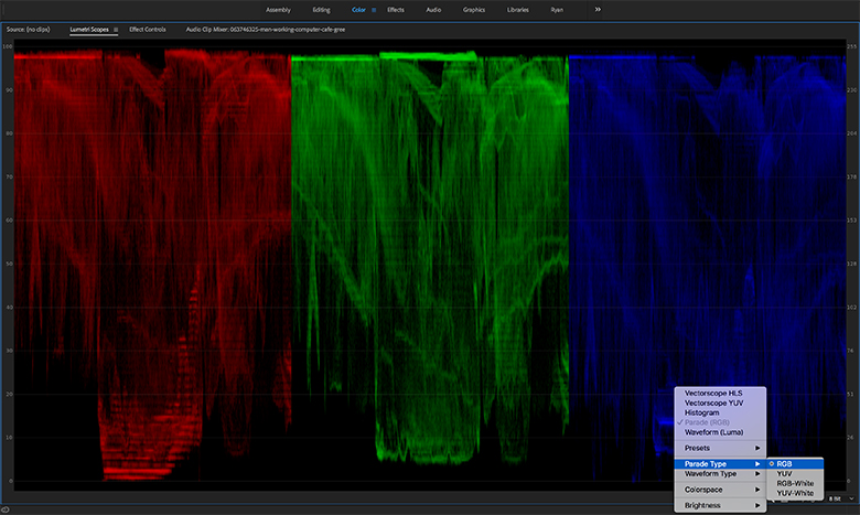
The Lumetri Scopes panel can show the color information in a shot in various ways. If you right-click in the scopes window, you will see options to display two different vectorscopes, a histogram, a parade, and a waveform. You can display all of these scopes simultaneously, or choose whichever ones you like. As you play shots in the timeline and program window, the scopes will display color and brightness information in real time.
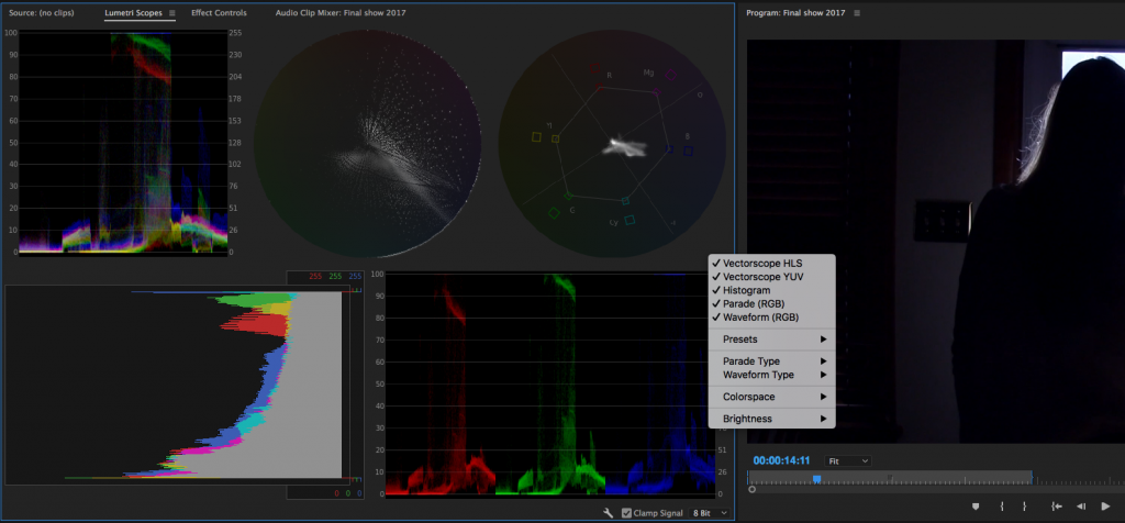
The most “advanced” scopes available are probably the two vectorscopes, which display color and hue information in a circular graph. The YUV vectorscope displays saturation based on distance from the center of the graph – signal close to the edge is saturated and signal near the center is monochromatic. We’ll take a closer look at the vectorscopes in a later lesson.
The waveform, histogram, and parade display color information based on the breakdown of red, green, and blue in the shot. On all three, 0 brightness (pure black) is at one end and 100 brightness (pure white) is on the other, allowing you to see both chrominance and luminance. I personally find the waveform and parade to be the most intuitive scopes to use, since they allow you to quickly see how much of each color is in the shot and what the overall exposure is.
Fixing White Balance
It’s almost inevitable that at some point, you will forget to set your white balance, set it incorrectly, or accidentally leave it on an automatic mode. In the midst of a shoot (especially using a small monitor), it’s all too easy to overlook – until you pull up the footage to review it.
While some white balance problems are obvious, you might not realize how off a clip is until you look at the scopes. In the waveform, you should be able to see if either the red, green, or blue channel is more prominent than the others. Of course, some shots naturally have more of one color in them than the others; green screen footage, for example, will show a lot of green in the waveform. Pay more attention to areas like highlights where you expect roughly equal amounts of the three colors.
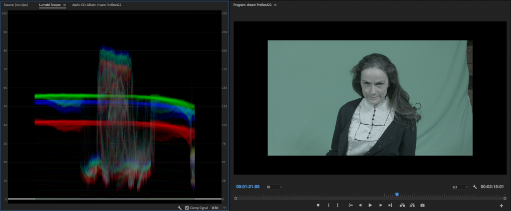
The simplest way to adjust for improper white balance is probably to use a Curves effect. Curves gives you graphs representing each of the three colors as well as luminance. You can use a pen tool to adjust the graph and change the amount of each color in the shot, as well as the overall brightness. What’s nice about this approach is that you can make very specific adjustments in the shadow or highlight areas of the image. However, recent versions of Premiere have moved the Curves effect to the “obsolete” section; instead there is now a Curves section of the Lumetri effect. I still use Curves from time to time, though, since it’s such an easy way to make a quick adjustment.
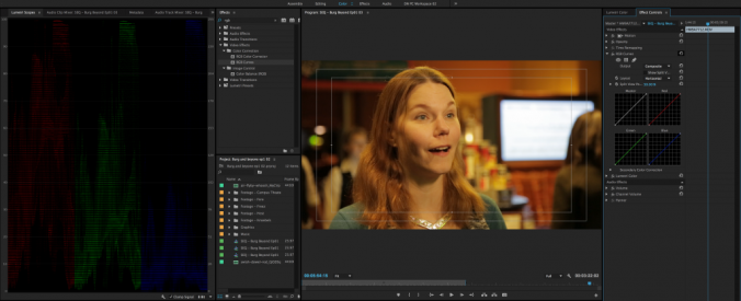

The benefit of the Lumetri effect is that it gives you a ton of different color-adjustment tools in one place in a fairly logical order. There are sections for Basic Correction, Creative, Curves, Color Wheels, HSL Secondary, and Vignette. The idea is that you would go through these sections in order to finalize the look of your footage. While that doesn’t always work out exactly, it does provide a very good framework for refining color.
There is an area of the Basic Correction section of Lumetri dedicated to fixing white balance, so let’s start there. As soon as you make an adjustment in the Lumetri Color panel, the effect will be added to the Effect Controls of whatever clip you have highlighted. If you don’t see the Lumetri Color panel, either switch to the Color workspace or select the panel from the Window menu.
The White Balance options in Lumetri are comprised of an eyedropper selector and two slider bars: one blue and orange and one green and magenta. The eyedropper can be used to select an area of the frame that should be pure white – it will make an automatic adjustment based on that. This can be a good place to start from, but I prefer to dial in the white balance manually, using the Temperature and Tint sliders. Since most white balance issues stem from the camera being set to record either too “warm” or too “cool,” the temperature option usually takes care of the most significant issues. Just slide the dial in the direction that the footage needs to go. As you do so, watch the scopes to see the effect that the adjustment is making in a more objective way. If there is too much green or red in the shot after the temperature has been adjusted, make some adjustments to the Tint slider.
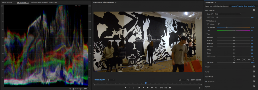
If there are still areas of the image that still seem off, trust your eye over the scopes. Again, shots naturally have different levels of color in them. Pay the most attention to skin tones, since they are what will immediately tip your audience off to problems in the shot.
Fixing Exposure
If a shot is too dark or blown out, you can also make some basic adjustments to exposure in the first section of the Lumetri Color effect. The Tone area contains sliders for exposure, contrast, highlights, shadows, whites, and blacks, as well as “HDR Specular,” which you probably won’t need to worry about. There’s also an auto-adjustment button, but – again – I’d suggest doing this work manually. The sliders in this section go from most extreme to least: Exposure and Contrast will make dramatic changes to the entire image; Highlights and Shadows affect specific brightness ranges; and Whites and Blacks target only the brightest and dimmest areas of the image.
I’d suggest starting with the highlight and shadow sliders, if necessary, then dialing in the white and black levels. It can be tempting to just crank the exposure adjustment up or down, but it makes such a sweeping change that I try to avoid this unless absolutely necessary. The more you raise the exposure, the more digital noise and distortion you will introduce into the image, so don’t change this more than you have to.
With the exposure and white balance adjusted, you are ready to start adding a more stylized look to your footage. That can be achieved, in large part, using the rest of the Lumetri Effect – the Creative, Curves, Color Wheels, HSL Secondary, and Vignette sections. We’ll take a deeper look at those options soon.
Best of the Best
Who’s the greatest cinematographer of all time? While I think there are some names missing from this particular list (Emmanuel Lubezki, Christopher Doyle), it’s a great overview of some of the best in the business. You’ll never guess who gets the top spot.
Shooting Schedule
Here’s the revised script for the collaborative project, with additional info about location, shoot date, actors, and the person in charge of each sequence.
Scene 1: Parking Lot
DP: Max
Location: TBD
Shoot Date: TBD
Actors: Casey, driver
Exterior, night – a foggy parking lot. Cool light glints faintly off the hood of a car. A shadowy figure – the courier – moves into frame and the headlights come on, throwing them into sharp silhouette. The car’s window begins to roll down and the courier walks over to it. A small object is passed out of the window. The courier takes it and exits.
Same location – we see the handle of a door. The courier pulls it open and enters a building.
Scene 2: Hallway
DP: Casey
Location: TBD
Shoot Date: March 30
Actors: Casey
The courier is now moving through a long, strange hallway. As they near its end, the sound of music increases.
Scene 3: Club
DP: Alex and Casey
Location: Studio
Shoot Date: March 23
Actors: Casey, dancers
Interior, a club environment with brightly colored, flashing lights. The courier enters the room and is surrounded by a small knot of people dancing. The courier removes the an old bellows-style camera from their coat and fires off a shot. The flashing lights – and people – disappear. On the ground in front of the courier is a small orb of glowing purple light. She picks it up and the world around her disappears.
Scene 4: Jungle
DP: Alex
Location: Greenhouse
Shoot Date: March 30
Actors: Casey
The courier is in a completely different environment, surrounded by lush greenery and enveloped in warm light. She surveys the environment and take another shot. The color around her drains away and another orb – now green – appears. She takes it.
Scene 5: Virtual Environment
DP: Dante
Location: Studio
Shoot Date: March 23
Actors: Casey
The environment changes again. The courier is now in a misty graveyard. Once more, the courier surveys the environment, take a snapshot, and collects an orb, now cool blue.
Scene 6: Lair
DP: Brian
Location: Studio
Shoot Date: March 23 or April 6
Actors: Casey and Brian
Again, the environment changes. The courier is in a dark room with long slashes of light falling across the wall. They advance slowly.
Same location. There is a figure seated at a desk, rimmed in light – the boss. The courier advances towards the boss with the camera. On cue, lights from the left and then the right appear, illuminating the boss. They look up at the courier.
The boss: “Do you have it?”
The courier nods, sets the camera on the desk before the boss, and backs away.
Scene 7: Finale
DP: Justin
Location: Studio
Shoot Date: March 23 or April 6
Actors: Casey and Brian
The boss opens the back of the camera. Light spills out from it.
Colored lights flash across the faces of the boss and courier. The courier looks on nervously. The boss smiles. After a few moments of this, the boss lowers the lid again.
The room falls back into near darkness. The boss looks up to the courier.
The boss: “Nice work.”
The courier nods, then turns and walks away.
It’s Complicated.
There is some debate in the filmmaking community – even among professionals – as to whether sensor-size crop factor should be applied to aperture. As you may recall, the size of a camera’s sensor affects the apparent focal length of a lens – so, a 25mm lens on a four-thirds sensor has the same field of view as a 50mm lens on a full frame sensor. Is aperture affected in the same way?
The answer is… sort of. Aperture is the measure of the size of the opening in the lens through which light enters the camera, which affects brightness and depth of field. The size of the sensor does not change the size of a lens’s aperture, so the overall brightness does not change. However, depth of field is directly affected by focal length – long lenses produce a shallower depth of field than short lenses. So the depth of field (the amount of background blur) is affected by by crop factor since, for example, a 25mm lens will always produce less background blur than a 50mm lens at the same aperture. In short, depth of field is affected by sensor size (indirectly), but overall brightness is not.
THE DROP
Exterior, night – a foggy parking lot. Cool light glints faintly off the hood of a car. A shadowy figure – the courier – moves into frame and the headlights come on, throwing them into sharp silhouette. The car’s window begins to roll down and the courier walks over to it. A small object is passed out of the window. The courier takes it and exits.
Same location – we see the handle of a door. The courier pulls it open and enters a building.
The courier is now moving through a long, strange hallway. As they near its end, the sound of music increases.
Interior, a club environment with brightly colored, flashing lights. The courier enters the room and is surrounded by a small knot of people dancing. The courier removes the an old bellows-style camera from their coat and fires off a shot.
The flashing lights – and people – disappear. The courier is in a completely different environment, surrounded by lush greenery and enveloped in warm light. They survey the environment and take another shot.
The environment changes again. The courier is now in a misty graveyard. They survey the environment again, and take another shot.
Again, the environment changes. The courier is in a dark room with long slashes of light falling across the wall. They advance slowly.
Same location. There is a figure seated at a desk, rimmed in light – the boss. The courier advances towards the boss with the camera. On cue, lights from the left and then the right appear, illuminating the boss. They look up at the courier.
The boss: “Do you have it?”
The courier nods, sets the camera on the desk before the boss, and backs away.
The boss opens the back of the camera. Light spills out from it.
Colored lights flash across the faces of the boss and courier. The courier looks on nervously. The boss smiles. After a few moments of this, the boss lowers the lid again.
The room falls back into near darkness. The boss looks up to the courier.
The boss: “Nice work.”
The courier nods, then turns and walks away.
END
Gromit Gets Lit
Ever wonder how lighting is done on a miniature scale for stop-motion animation? Check out this video from Cooke Optics.
Group 1 – Max, Brian, Alex
Group 2 – Justin, Casey, Dante
Collaborative Lighting
Over the next two weeks, we’re going to be working on our mid-semester project. Filmmaking is a collaborative process, so rather than assigning everyone an individual project, we’re going to work on this project as a group. You will each be graded based on your creative input, your on-set skills and knowledge, and your ability to work as part of a team.
For this project, we’ll be filming a series of shots, each with a different lighting concept. There should be continuity between the shots – such as a character exiting one side of the frame and entering the next shot from the opposite side – but they should have totally different lighting. Our goal here is to showcase different lighting techniques and ultimately create a unified piece – a sort of showreel for the class.
Again, I want this to be collaborative, so we can work on the specifics of each shot and the overall narrative together. There should be at least six setups; here are some things I would like to include:
Each of you will take the lead as cinematographer on one of the setups. Once we decide together exactly what we’ll be filming, we can assign the different scenes. On your setup, you are welcome to ask questions and get input from the rest of the group, but you’ll be making the final lighting decisions.
The goal is to finish this project during the class periods on March 2 and March 9 – if we absolutely need to, we can wrap things up after the break, though.
Here’s how you’ll be graded on this project:
25 points – overall look and effectiveness of the finished shot
25 points – knowledge and technique during your assigned setup
25 points – input and help on other setups
25 points – safety and correct equipment use
100 points total
Let’s work together, have fun, and make something cool!
Wrapping Up Lighting
Before we break for the mid-semester recess and move on to the wonderful world of color grading, there are a few last tips and techniques I’d like to discuss.
There are also some great videos that have been posted to the Blog Posts section of the site, so be sure to check those out when you get a chance!
Shooting Log and Other Camera Settings
If you pay attention to the wold of indie filmmaking, you’ve probably heard people extol the wonders of “log” settings on various cameras. Different manufacturers use their own log variants: high-end Sony cameras come installed with S-Log (usually multiple versions), Panasonic has V-Log, Canon has C-Log, and so on. So what is a log setting and why do people get so excited about it?
Simply put, log is a camera setting that lowers the contrast and saturation of the image being recorded; a “flat” picture profile. Log footage is pretty unpleasant-looking at first – milky, bland, and washed-out. Log footage comes to life in the color-grading process when saturation and contrast is added back into the image. Because you are starting with more of a blank slate, log footage can be color graded and tweaked more aggressively in post-production.
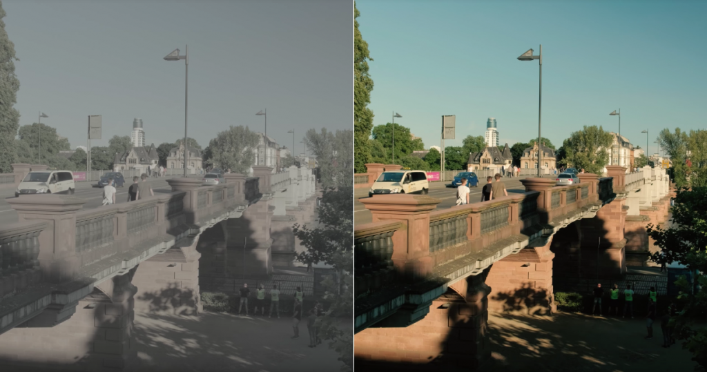
So should you always be shooting using a log profile? Actually, no. Because log footage has low contrast, it protects the details in both shadows and highlights. That makes it great for shooting environments with very bright areas and very dark areas. However, if you’re in a situation where you don’t need to recover details from both the shadows and the highlights, there really isn’t much point to shooting log – you’d only be adding unnecessary work later.
There are also lots of cases where you definitely should not use a log profile. Because log footage requires intensive color grading, it can actually create more prominent noise and grain in the dark areas. In low-light shooting, log footage can end up looking much worse than footage shot with a normal picture profile. If you are taking the time to properly light and expose your image – so that you are capturing what you want in-camera – then shooting log might be unnecessary or even negative. You should avoid log shooting when filming against a green screen, since you want the screen itself to be as saturated as possible.
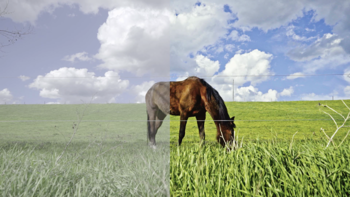
The way your camera records video files also makes a difference as to whether or not you should shoot log. Without getting too technical, cameras that use low compression (4:2:2 as opposed to 4:2:0) and capture lots of color information (12 or 10-bit as opposed to 8-bit) using a robust codec (RAW or ProRes as opposed to H.264) will do better with log footage. In our collection, the BlackMagic Pocket Camera and Sony FS5 are better suited to using flat picture profiles than cameras like the GH3 and AF100.
Finally, shooting log can be problematic because it’s difficult to imagine what your finished footage will look like when everything is desaturated and grey – it can even be challenging to light and expose correctly, since the footage appears so flat. However, some cameras and external monitors (like our SmallHD DP7-Pro) will allow you to load a LUT (essentially a color-grading preset) and preview your footage with a more finished look.
In summary, log recording is potentially useful, but it definitely has a time and place – I think that lots of inexperienced shooters record in log simply because they can. We’ll look at the specifics of color grading log footage later in the semester.
Whether or not you shoot log, there are other camera settings that you may want to tweak before filming. Our Panasonic GH3 and GH4 cameras have several picture profiles available, with different levels of saturation, color balance, and contrast. This becomes a matter of personal preference, but I like the “Natural” profile on these cameras, since it has a slightly lower contrast “filmic” look, without dipping into the flat look of a log profile.
On cameras where such things can be tweaked, you may want to slightly turn down the sharpening, contrast, saturation, or noise reduction. Doing so will give you more flexibility in post-production – all of those factors can be quickly added back using editing or color grading software – while avoiding the potential pitfalls of shooting log.
Problematic Practicals
We’ve talked about practical lights – lights that are visible within the shot – quite a bit already. Practical lights are great for adding ambience and “motivating” the lights that you have placed off-camera. However, sometimes practical lights can cause unexpected issues when filming.
Flicker is the most common problem you are likely to run into. You may notice that certain light fixtures and screens pulsate when filmed. This is the result of the interaction between the frequency at which the light is emitted and the shutter speed of the camera.
Fortunately, this fix is usually pretty simple. You probably can’t change the frequency of the light in the shot, but can change your camera’s shutter speed. Adjusting it up or down will almost always clear up the issue. Of course, changing the shutter speed will affect your exposure – and, to a lesser extent, the amount of motion blur in the shot – so you don’t want to alter it more than you need to. However, it’s almost always easier to fix this issue on set than try to salvage the footage in post-production later.
The other common issue with practical lighting is color temperature. Professional video lights are specially calibrated and tested to emit light of a certain color (or be adjustable as needed). Random lightbulbs on set are not. The lights in your scene may be warmer or cooler than the lighting you would like to use. If this is the case, I’d suggest adding some CTO or CTB to the light to take care of the issue. If that’s not possible, you may need to adjust your off-camera lights and play with the white balance of your camera to resolve the issue.
Lighting Multiple Subjects
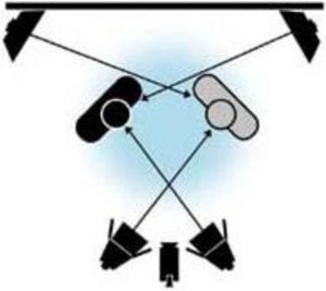
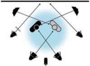
This topic has been asked about a few times, so I thought I’d address it. Most of the time, you will probably be lighting primarily for one subject – even in shots with multiple actors, most shots will be focused on one of them. In wide shots, master shots, and shots with multiple subjects, however, you may need to light multiple actors.
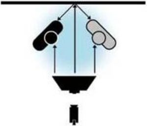
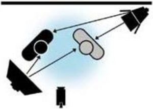
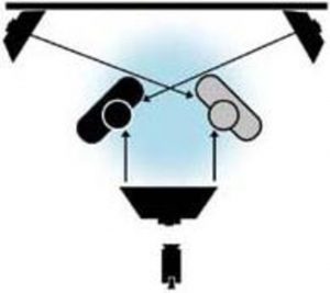
Lighting for multiple subjects isn’t really any different than lighting a single subject: if both actors are facing the camera, they should both have key lighting, fill lighting, and back lighting, in addition to any lights illuminating the background. Depending on how your actors are positioned, you may be able to use the same key, fill, and/or back lighting for both of them; or, you may need two sets of lights.
There are alternative methods to lighting multiple subjects, though. I found the following lighting diagrams in an old issue of Videomaker Magazine.
Transforming the Space
Here’s an informative video from Cinematography Database in which one room is lit for three different looks – sunset, day, and night.
https://www.youtube.com/watch?v=wDZWTKH8NOE