Red, Green, and Blue
All color film and video is made up of the combination of three colors: red, green, and blue. Color correction and grading is the act of altering the relationship between those three colors. Until fairly recently, when color grading was a chemical process, film negatives were exposed to different chemicals to change the amount of red, green, and blue in a sequence. Strips of film were placed into chemical baths for a very specific amount of time to do this, which is why color grading was once also called “color timing.”
Color grading, color correction, and even color timing are still used as largely interchangeable terms. However, I’d like to draw a distinction between correction and grading. When I refer to color correction, I’m talking about the initial “fix it” stage of the color manipulation process. Color correction largely involves making changes to a shot’s overall brightness, raising or lowering the shadows and highlights, and compensating for white balance issues. I think of color grading as the stage where you add a distinctive style to a piece. Grading is the stage where you dial in the film’s “look” – you might crush the blacks, or warm up the highlights, add a vignette, or make other aesthetic choices.
In order to get to the color grading stage, you have to start with the color correction stage. It’s important that you start with a “blank canvas.” Today, we’ll be focusing on the correction process.
Software Options
We’ll be using the color correction and grading tools in Adobe Premiere Pro over the next few weeks. Adobe also has a dedicated color grading program called SpeedGrade, which offers a lot of fine control and advanced features. However, Adobe hasn’t updated SpeedGrade since the 2015 version. Instead, they’ve migrated many of the features – and some new ones – into Premiere, making it a more viable all-in-one option for editing and color work.
Despite the lack of updates, SpeedGrade is still a solid piece of software and a good option for color correction and grading. DaVinci Resolve is another popular options; DaVinci has approached the issue from the opposite direction as Adobe, by starting with dedicated color software and adding more and more editing functionality to it. Some editors have switched from Premiere to Resolve because of its stability and advanced color features. There’s even a free version of the software called Resolve Studio. Final Cut Pro X has its own set of color tools, some of which are quite good. Like a lot of the features in Final Cut, however, a lot of the process has been streamlined and automated.
Scopes
If you’ve spent some time using Premiere, you may be aware of the different workspace configurations it offers. Along the top of the program, you should see options including Assembly, Editing, Color, Effects, Audio, and more. These can also be found in the Workspaces section of the Window dropdown menu at the top of the screen. Like most Adobe programs, your workspace can be completely customized. You can choose individual windows from the Window menu, rearrange and resize them by clicking and dragging, and save a custom workspace. If things ever start to look strange, you can always reset your workspace by choosing Reset to Saved Layout from the Workspaces menu. I find that the Color workspace is actually quite useful for color correction and grading, so I use that preset often.

There are two important panels that will appear when you select the Color workspace: Lumetri Color and Lumetri Scopes. Lumetri is the suite of color-related tools that Adobe has been focusing on ever since SpeedGrade was discontinued. Many of the color tools in its library are available elsewhere, but Lumetri gathers the most important and useful ones together in one place.
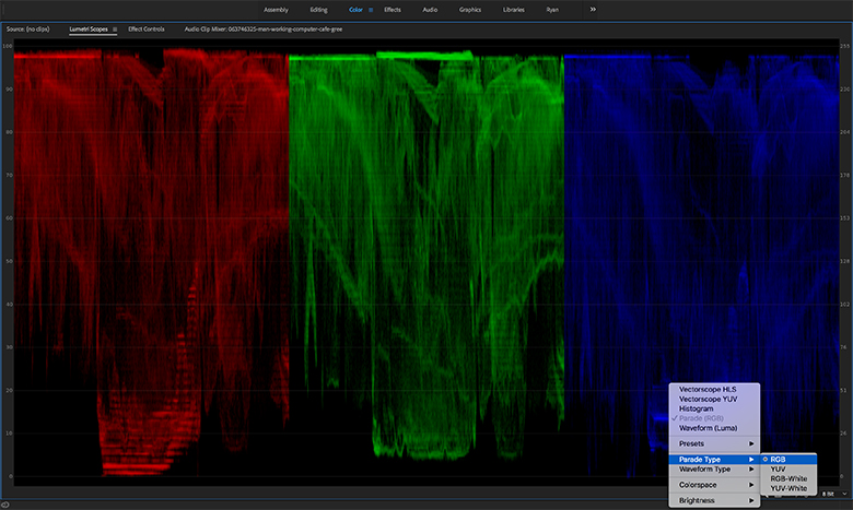
The Lumetri Scopes panel can show the color information in a shot in various ways. If you right-click in the scopes window, you will see options to display two different vectorscopes, a histogram, a parade, and a waveform. You can display all of these scopes simultaneously, or choose whichever ones you like. As you play shots in the timeline and program window, the scopes will display color and brightness information in real time.
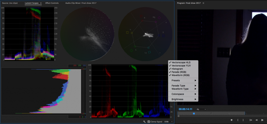
The most “advanced” scopes available are probably the two vectorscopes, which display color and hue information in a circular graph. The YUV vectorscope displays saturation based on distance from the center of the graph – signal close to the edge is saturated and signal near the center is monochromatic. We’ll take a closer look at the vectorscopes in a later lesson.
The waveform, histogram, and parade display color information based on the breakdown of red, green, and blue in the shot. On all three, 0 brightness (pure black) is at one end and 100 brightness (pure white) is on the other, allowing you to see both chrominance and luminance. I personally find the waveform and parade to be the most intuitive scopes to use, since they allow you to quickly see how much of each color is in the shot and what the overall exposure is.
Fixing White Balance
It’s almost inevitable that at some point, you will forget to set your white balance, set it incorrectly, or accidentally leave it on an automatic mode. In the midst of a shoot (especially using a small monitor), it’s all too easy to overlook – until you pull up the footage to review it.
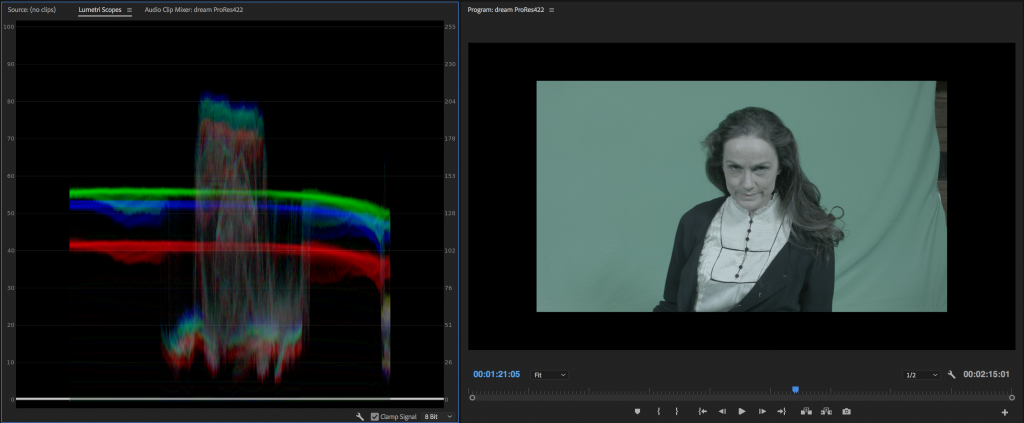
While some white balance problems are obvious, you might not realize how off a clip is until you look at the scopes. In the waveform, you should be able to see if either the red, green, or blue channel is more prominent than the others. Of course, some shots naturally have more of one color in them than the others; green screen footage, for example, will show a lot of green in the waveform. Pay more attention to areas like highlights where you expect roughly equal amounts of the three colors.
The simplest way to adjust for improper white balance is probably to use a Curves effect. Curves gives you graphs representing each of the three colors as well as luminance. You can use a pen tool to adjust the graph and change the amount of each color in the shot, as well as the overall brightness. What’s nice about this approach is that you can make very specific adjustments in the shadow or highlight areas of the image. However, recent versions of Premiere have moved the Curves effect to the “obsolete” section; instead there is now a Curves section of the Lumetri effect. I still use Curves from time to time, though, since it’s such an easy way to make a quick adjustment.
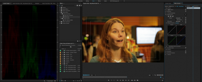

The benefit of the Lumetri effect is that it gives you a ton of different color-adjustment tools in one place in a fairly logical order. There are sections for Basic Correction, Creative, Curves, Color Wheels, HSL Secondary, and Vignette. The idea is that you would go through these sections in order to finalize the look of your footage. While that doesn’t always work out exactly, it does provide a very good framework for refining color.
There is an area of the Basic Correction section of Lumetri dedicated to fixing white balance, so let’s start there. As soon as you make an adjustment in the Lumetri Color panel, the effect will be added to the Effect Controls of whatever clip you have highlighted. If you don’t see the Lumetri Color panel, either switch to the Color workspace or select the panel from the Window menu.
The White Balance options in Lumetri are comprised of an eyedropper selector and two slider bars: one blue and orange and one green and magenta. The eyedropper can be used to select an area of the frame that should be pure white – it will make an automatic adjustment based on that. This can be a good place to start from, but I prefer to dial in the white balance manually, using the Temperature and Tint sliders. Since most white balance issues stem from the camera being set to record either too “warm” or too “cool,” the temperature option usually takes care of the most significant issues. Just slide the dial in the direction that the footage needs to go. As you do so, watch the scopes to see the effect that the adjustment is making in a more objective way. If there is too much green or red in the shot after the temperature has been adjusted, make some adjustments to the Tint slider.
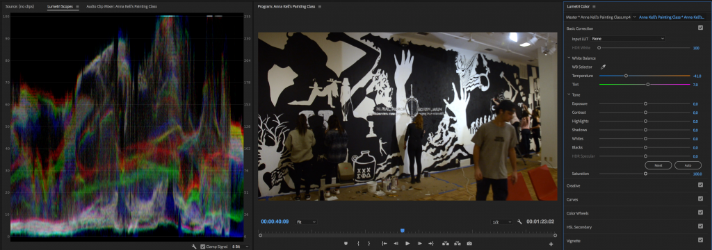
If there are still areas of the image that still seem off, trust your eye over the scopes. Again, shots naturally have different levels of color in them. Pay the most attention to skin tones, since they are what will immediately tip your audience off to problems in the shot.
Fixing Exposure
If a shot is too dark or blown out, you can also make some basic adjustments to exposure in the first section of the Lumetri Color effect. The Tone area contains sliders for exposure, contrast, highlights, shadows, whites, and blacks, as well as “HDR Specular,” which you probably won’t need to worry about. There’s also an auto-adjustment button, but – again – I’d suggest doing this work manually. The sliders in this section go from most extreme to least: Exposure and Contrast will make dramatic changes to the entire image; Highlights and Shadows affect specific brightness ranges; and Whites and Blacks target only the brightest and dimmest areas of the image.
I’d suggest starting with the highlight and shadow sliders, if necessary, then dialing in the white and black levels. It can be tempting to just crank the exposure adjustment up or down, but it makes such a sweeping change that I try to avoid this unless absolutely necessary. The more you raise the exposure, the more digital noise and distortion you will introduce into the image, so don’t change this more than you have to.
With the exposure and white balance adjusted, you are ready to start adding a more stylized look to your footage. That can be achieved, in large part, using the rest of the Lumetri Effect – the Creative, Curves, Color Wheels, HSL Secondary, and Vignette sections. We’ll take a deeper look at those options soon.