The Color Wheel
This week, we’re talking about color. This could be considered more of a general cinematography topic than a lighting-specific topic, since the color in a shot is defined by location, props, and wardrobe, as well as lighting; not to mention the crucial role of color correction in post-production. However, lighting plays a vital role in the color composition of a shot and some understanding of basic color theory is important for everyone behind the camera.
Color can be described using three properties: hue, saturation, and value. The hue is the color itself: blue, purple, yellow, magenta, etc.. The saturation is the intensity of the color. Value describes how light or dark the color is. We can use these terms to describe any shade of any color that we can see.
Red, yellow, and blue are the three primary colors. These three colors are the basis of all others; yellow and blue combine to make green, blue and red combine to make purple, yellow and red combine to make orange. Orange, purple, and green are the secondary colors, which can be further combined to make the tertiary colors like magenta, yellow-green, teal, and so on. If you place all of the colors on a wheel, with the primary colors equal distance from each other and the secondary colors in between them, and the tertiary colors in between them, you end up with the color wheel.
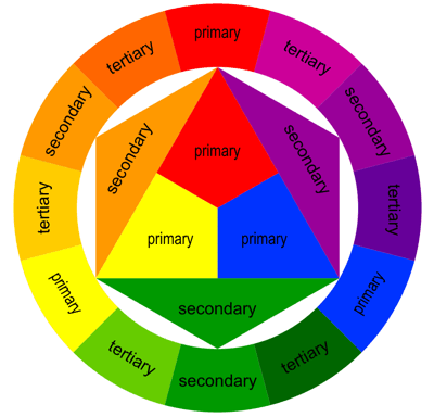
The color wheel is a hugely important tool for a cinematographer. It allows us to look at the relationships between the colors in a shot and judge how harmonious or chaotic they are. For a “standard” color wheel, red should be across from green, yellow should be across from purple, and blue should be across from orange, forming three primary/secondary pairs with the tertiary colors in between.
Color Schemes
Different color schemes are described in terms of the location of the colors in a shot on the color wheel. Harmonious color schemes us colors that are equidistant from each other on the color wheel. However, it’s also perfectly acceptable to deliberately use a non-harmonious color scheme to introduce tension or foreshadow conflict.
There are four main harmonious color schemes, plus the discordance scheme.
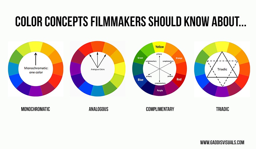
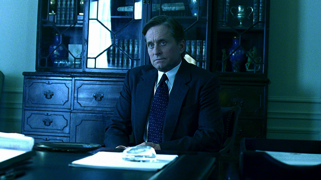
- Monochromatic – Monochromatic color schemes use only one color, with variations in saturation and value. Black and white film is obviously monochromatic, but color film can be as well. For example, there are many shots in The Matrix that are monochromatic green. Steven Soderbergh’s Traffic uses multiple monochromatic schemes to represent different areas and themes in the film.
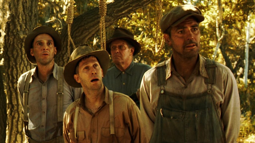
- Analogous – Analogous color schemes use colors that are adjacent on the color wheel. This creates a pleasant, unified look, with more variation than monochromatic schemes. In the following shot from O Brother, Where Art Thou?, yellow-green, yellow, and orange are the significant colors used.
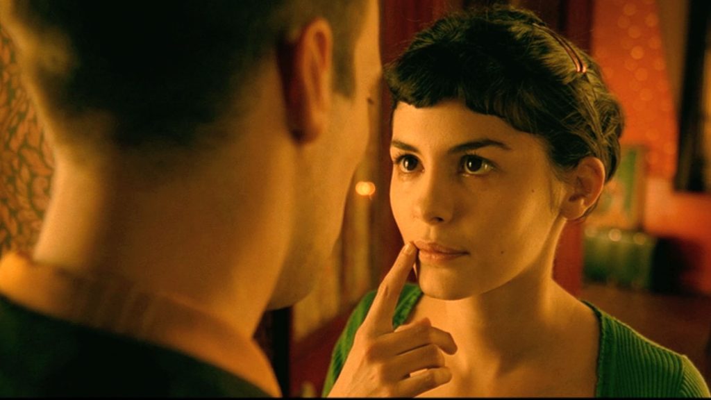
- Complementary – Complementary colors are opposite each other on the color wheel. This is a very common color scheme because it creates a visually-pleasing tension in the frame. Orange and blue are a common combination today, but other complementary pairs are frequently used as well. Many shots in Amelie are almost entirely red and green. Generally, one half of the complementary pair is predominant with the second color used for accents and highlights.
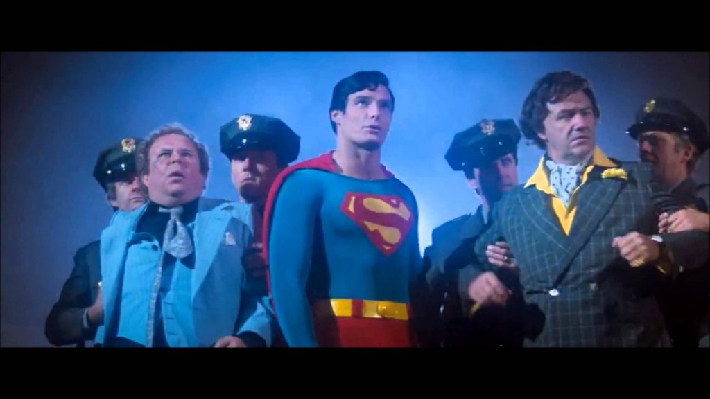
- Triadic – Triadic color schemes are somewhat uncommon; they involve three colors equally spaced on the color wheel. Yellow, blue, and red is probably the most common triadic combination, as seen in the following shot from Superman. Triadic color schemes are usually bright and vibrant – almost cartoony – because they rely on hues with so much variation.
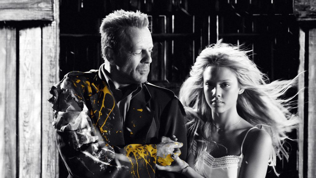
- Discordant – As the name implies, discordant color schemes deliberately break from the harmonious schemes described above. Sin City – with its splashes of color amidst high contrast black and white footage – is an obvious example, but there are subtler ways of achieving this effect as well. For example, a pop of blue will sometimes be inserted into the otherwise complementary red/green scheme of Amelie.
There are other color schemes as well; for example, a quadratic color scheme would involve four colors equidistant from each other on the color wheel and a split-triadic involves one color opposite two colors that are near each other on the wheel. The five above are by far the most common, though.
Color Psychology
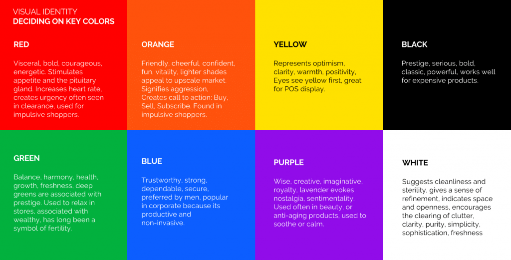
The basic idea of color psychology is that different colors carry different intrinsic meanings. Studies have shown that when seeing the color red, people experience an elevated heart rate; when we see blue tones, our breathing and heart rate slow down. Color theorists have assigned all sorts of meanings to different colors. Some are obvious, some might surprise you.
You can find lots of lists with colors and their meanings, each defined slightly differently, but most of them follow a similar structure.
- RED – anger, passion, rage, desire, excitement, energy, speed, strength, power, heat, love, aggression, danger, fire, blood, war, violence
- PINK – love, innocence, healthy, happy, content, romantic, charming, playfulness, soft, delicate, feminine
- YELLOW – wisdom, knowledge, relaxation, joy, happiness, optimism, idealism, imagination, hope, sunshine, summer, dishonesty, cowardice, betrayal, jealousy, covetousness, deceit, illness, hazard
- ORANGE – humor, energy, balance, warmth, enthusiasm, vibrant, expansive, flamboyant
- GREEN – healing, soothing, perseverance, tenacity, self-awareness, proud, unchanging nature, environment, healthy, good luck, renewal, youth, vigour, spring, generosity, fertility, jealousy, inexperience, envy
- BLUE – faith, spirituality, contentment, loyalty, fulfillment peace, tranquility, calm, stability, harmony, unity, trust, truth, confidence, conservatism, security, cleanliness, order, sky, water, cold, technology, depression
- PURPLE/VIOLET – erotic, royalty, nobility, spirituality, ceremony, mysterious, transformation, wisdom, enlightenment, cruelty, arrogance, mourning, power, sensitive, intimacy
- BROWN – materialistic, sensation, earth, home, outdoors, reliability, comfort, endurance, stability, simplicity
- BLACK – No, power, sexuality, sophistication, formality, elegance, wealth, mystery, fear, anonymity, unhappiness, depth, style, evil, sadness, remorse, anger
- WHITE – Yes, protection, love, reverence, purity, simplicity, cleanliness, peace, humility, precision, innocence, youth, birth, winter, snow, good, sterility, marriage (Western cultures), death (Eastern cultures), cold, clinical, sterile
- SILVER – riches, glamorous, distinguished, earthy, natural, sleek, elegant, high-tech
- GOLD – precious, riches, extravagance. warm, wealth, prosperity, grandeur
Want to see some specific examples? Check out this post.
The interesting thing about color psychology is that the meanings aren’t fixed. Warm red and yellow tones might represent safety in one film and danger in another. Individual characters can also have colors associated with them, which carry throughout a film.
Cinematographer Shane Hurlbut has a great post on how to use color to inform mood and tone on his blog. I’d also recommend the book If It’s Purple, Someone’s Gonna Die, by Patti Bellantoni.
Equipment
Here are some of the tools we have at our disposal for manipulating color.
- Variable Temperature Lights – Many of the lights in our collection have a fixed color temperature of either daylight (5600K) or tungsten (3200K). Other lights, such as the small Genaray panels, can be adjusted between tungsten and daylight. A few of our large LED lights, such as the Celeb, Source Four, and Arri L7-C can actually emit light of various hues and saturations.
- Gels – Gels are transparent sheets of colored plastic plastic. You can get gels in just about any hue you can imagine and they can be fun to throw onto a fill or back light for a little pop of color. Exercise caution when using gels with halogen lamps, since not all gels are made to withstand high temperatures.
- CTO and CTB – CTO and CTB stand for Color Temperature Orange and Color Temperature Blue. These are gels used to modify the color temperature of a light; so, if you need to match a tungsten fresnel to a daylight LED panel, you could put CTB on the fresnel.
- Reflectors – Most reflectors come with multiple sleeves: white, black, silver, and gold. Using the silver of gold side can add some color depth to a shot.
- Practicals – Let’s not forget about the lights that are visible in a shot; lamps, neon signs, screens, and other sources of practical light can contribute to the color palette.