Driving In My Car, Living Like A Star
Need to film a scene in an automobile? Check out these tutorials for lighting car interiors.
https://www.youtube.com/watch?v=T1vJ0y2PBBM
Driving In My Car, Living Like A Star
Need to film a scene in an automobile? Check out these tutorials for lighting car interiors.
https://www.youtube.com/watch?v=T1vJ0y2PBBM
When the Lighting Gets Tough…
This week, let’s look at some slightly challenging lighting situations: green screen, low-light/night shots, and the great outdoors.
Outdoor Lighting
Want a quick way to make your footage look better? Shoot it outside! There is a ton of light outdoors and digital cameras love light. The ambient light you get outside will help your image quality, but it can also make shaping and controlling the light more difficult. Here are the tools and techniques you should be using.
Night Lighting
Lighting at night – or lighting for a nighttime look – poses the opposite problem from shooting outdoors in daylight. Virtually all digital cameras struggle in low light, so night shoots require an extra level of planning.
https://www.youtube.com/watch?v=8qz2gq3frA8
Green Screen Lighting
The key to good green screen compositing isn’t the post-production process you use – it’s the prep you do on set. Lighting and exposing your green screen effectively will save you countless headaches later.
Recreating the Scene
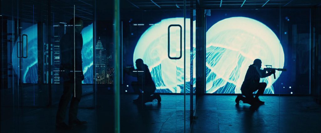
The folks over at The Camera Store TV do some of the best camera reviews on the web, but they sometimes take on more creative projects as well. Here, watch as they recreate scenes from Goodfellas and Collateral.


Shaping Light
At this point, we’ve spent some time discussing fundamental lighting setups, equipment, and the use of color. Next, we’ll start looking at more specialized equipment that can be used to create stylized looks. A lot of that comes down to our ability to shape light effectively.
We know that a light’s size and distance affects the hardness of the shadows it casts: lights that are small and/or far away cast hard shadows and lights that are large and/or nearby cast soft shadows. As we look at examples from different genre styles, think about the hardness or softness of the shadows being cast, as well as the contrast ratio between the light and dark areas.
However, we have additional tools for controlling where light falls within a frame. Flags, gobos, cookies, and barn doors are pieces of equipment with weird names that all do the same thing – block and control the light being emitted.
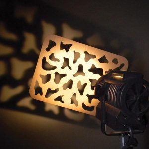
A flag is simply an object that blocks light. It can be virtually any size and it can be used to control light spill, prevent lens flares, or simply create negative fill. Cookies and gobos are both light “stencils” – they have opaque and transparent areas that create a pattern when light shines through them. Cookies and gobos can be used subtly, to give some variation to a light, or overtly, to create distinct patterns on the screen. The difference between cookies and gobos lies in their placement: cookies (the word is actually short for cucoloris) are put in front of a light and gobos (which stands for GO Before Optics) go inside the light itself. Not all lights can accept gobos (since they need to be inserted into the light itself), but cookies can be used with any light source.
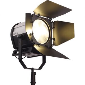
Barn doors are flags that are attached directly to the light itself. Many lights incorporate barn doors, but they are most commonly found on fresnels. Barn doors are used to shape and control the light being emitted. Some lights have a barn door on one side, some have two, and some have four. Barn doors are usually removable. Lights such as soft boxes and some LED panels that are designed to cast soft even light over a large area do not use barn doors.
Enhancing Light
We talked last week about how color can be used to reinforce the themes, aesthetics, and psychology of a scene. Continue thinking about color as we look at different genres and styles. How is the color palette of a western different from a horror film? What are the similarities and differences between a thriller and a science fiction film? Or a period piece and a romantic comedy?If you are looking to emulate a certain style of film, it’s important to emulate its color palette.
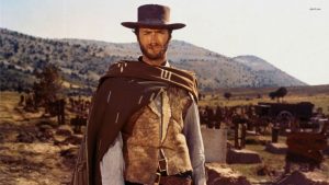
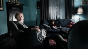
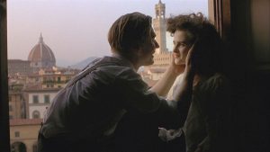
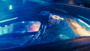
We have tools such as gels, color-adjustable lights, and reflectors to manipulate color, as well as basic production choices such as location, wardrobe, and what practical lights are in the shot. We can also completely change the lighting in a scene using fog or haze.
Fog and haze are technically different, but they can be used to achieve similar results. Fog is the less expensive option; it creates a more dynamic, less uniform effect than haze. Both can be used add (literal) atmosphere to a scene.
The obvious use for fog and haze would be something dark and moody like horror or science fiction. While fog can be great for that, it can also be used to give shots a bright, dreamy quality. Fog softens and diffuses light, so it can be used in almost any situation, as long as it’s sufficiently spread out. Fog can give a soft glow to a romantic scene or add swirly mist to a gritty drama – it’s more versatile than you might initially think.
Here are some tips on using fog from Film Riot:
We have a fog machine that can be checked out – just remember, this fog can absolutely set off a smoke detector. You can also purchase canned fog, if you need something more portable.
Project 3: Genre Looks
The next project will be done in two groups of three; you can divide up however you choose. Each group should create three video clips between 10 and 30 seconds each – each one emulating a different genre style. You should not do any editing or color correction to the clips and they should all be in color. Your goal here is to capture different looks in camera.
Possible genres are:
Think about contrast ratios, color palettes, locations, and practical lighting as you work on this project.
This is due by 10pm on March 1. You can submit work to me at dan014@bucknell.edu via WeTransfer.
Batman to Basic Instinct
Here’s a quick video with some great tips on emulating the lighting from iconic interrogation scenes.
From Zack Snyder to Akira Kurosawa
Courtesy of StudioBinder, here are a few videos that look at how different directors use color schemes and color psychology in their films.
The Color Wheel
This week, we’re talking about color. This could be considered more of a general cinematography topic than a lighting-specific topic, since the color in a shot is defined by location, props, and wardrobe, as well as lighting; not to mention the crucial role of color correction in post-production. However, lighting plays a vital role in the color composition of a shot and some understanding of basic color theory is important for everyone behind the camera.
Color can be described using three properties: hue, saturation, and value. The hue is the color itself: blue, purple, yellow, magenta, etc.. The saturation is the intensity of the color. Value describes how light or dark the color is. We can use these terms to describe any shade of any color that we can see.
Red, yellow, and blue are the three primary colors. These three colors are the basis of all others; yellow and blue combine to make green, blue and red combine to make purple, yellow and red combine to make orange. Orange, purple, and green are the secondary colors, which can be further combined to make the tertiary colors like magenta, yellow-green, teal, and so on. If you place all of the colors on a wheel, with the primary colors equal distance from each other and the secondary colors in between them, and the tertiary colors in between them, you end up with the color wheel.
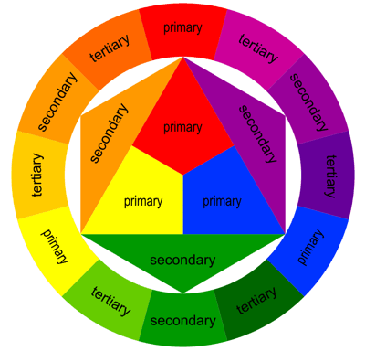
The color wheel is a hugely important tool for a cinematographer. It allows us to look at the relationships between the colors in a shot and judge how harmonious or chaotic they are. For a “standard” color wheel, red should be across from green, yellow should be across from purple, and blue should be across from orange, forming three primary/secondary pairs with the tertiary colors in between.
Color Schemes
Different color schemes are described in terms of the location of the colors in a shot on the color wheel. Harmonious color schemes us colors that are equidistant from each other on the color wheel. However, it’s also perfectly acceptable to deliberately use a non-harmonious color scheme to introduce tension or foreshadow conflict.
There are four main harmonious color schemes, plus the discordance scheme.
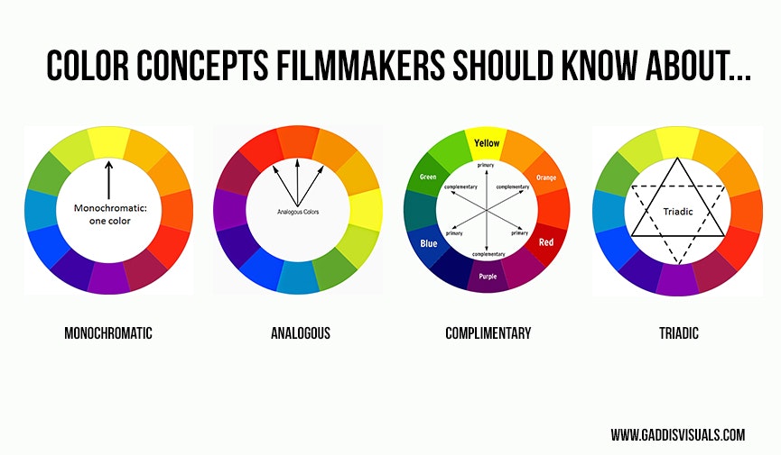
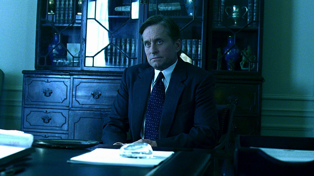
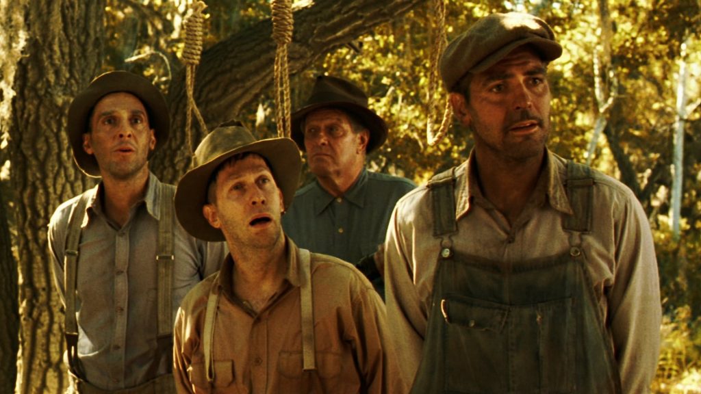
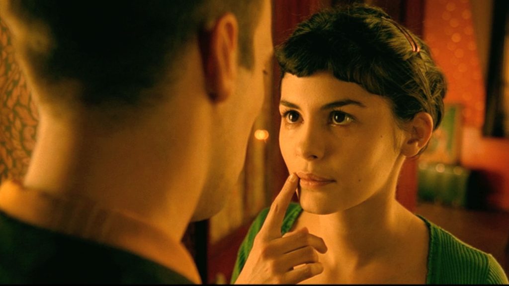
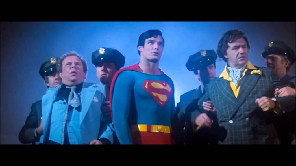
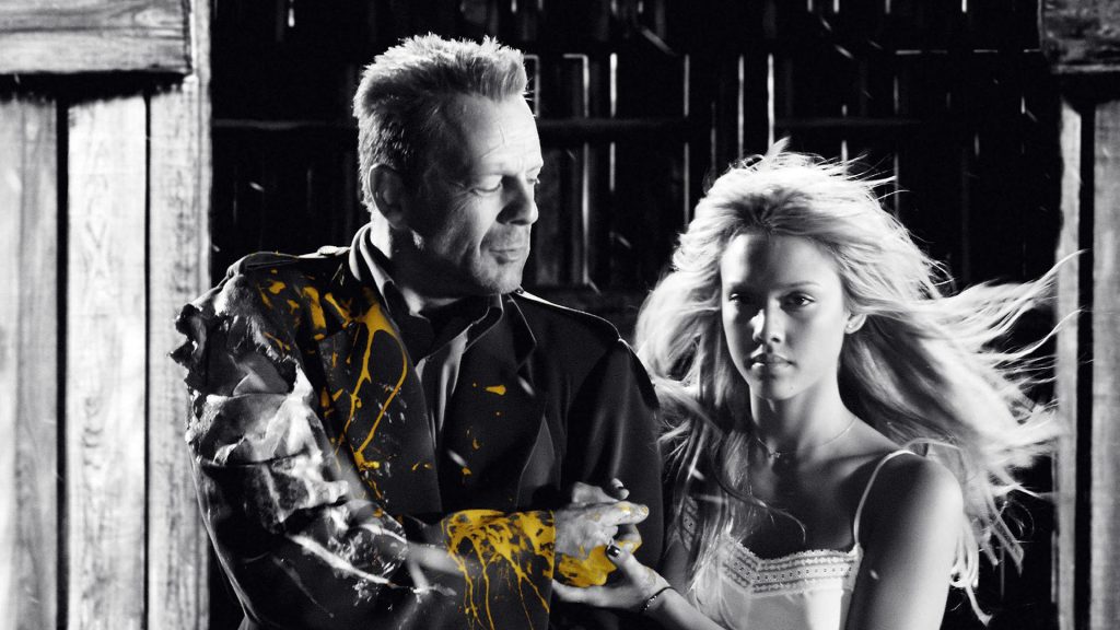
There are other color schemes as well; for example, a quadratic color scheme would involve four colors equidistant from each other on the color wheel and a split-triadic involves one color opposite two colors that are near each other on the wheel. The five above are by far the most common, though.
Color Psychology
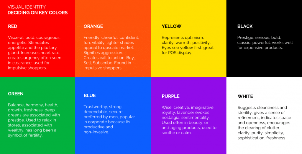
The basic idea of color psychology is that different colors carry different intrinsic meanings. Studies have shown that when seeing the color red, people experience an elevated heart rate; when we see blue tones, our breathing and heart rate slow down. Color theorists have assigned all sorts of meanings to different colors. Some are obvious, some might surprise you.
You can find lots of lists with colors and their meanings, each defined slightly differently, but most of them follow a similar structure.
Want to see some specific examples? Check out this post.
The interesting thing about color psychology is that the meanings aren’t fixed. Warm red and yellow tones might represent safety in one film and danger in another. Individual characters can also have colors associated with them, which carry throughout a film.
Cinematographer Shane Hurlbut has a great post on how to use color to inform mood and tone on his blog. I’d also recommend the book If It’s Purple, Someone’s Gonna Die, by Patti Bellantoni.
Equipment
Here are some of the tools we have at our disposal for manipulating color.
ISO Means What?
Ever been confused by the myriad of strange terms photographers use? So has everyone who has ever held a camera. Photo and video gurus Tony and Chelsea Northrup get mad about it in this funny – but painfully accurate – look at some of the least logical photography terms.
Stops of Light
In the first lesson, we discussed the basic properties of light: its color value, measured in degrees kelvin; and its brightness, measured in lux or foot-candles. However, there is another measure of light that you will probably hear discussed in relation to photography and video: the “stop.” It’s common to hear photographers talk about gaining or losing a stop of light – so how much light constitutes a stop?
Measuring light in stops is different than measuring light in lux, in two important ways. First, stops are used when measuring the amount of light coming into a camera, as opposed to the amount of light on the subject being photographed. Second, a stop of light describes light in relative terms, not absolute ones. Every time you add a stop, you are doubling the amount of light; and every time you lost a stop, you are cutting the amount of light in half.
Have you ever noticed that on most cameras, the ISO values double with each increment? Most cameras start at ISO 100, then jump to 200, then 400, 800, 1600, and so on. It makes sense that a camera set at ISO 800 is twice as sensitive to light as a camera set at ISO 400, which means that going from 400 to 800 adds a stop of light. Shutter speed works the same way: going from a shutter speed of 1/30 of a second to 1/60 of a second takes away a stop of light and vice versa. Aperture is the same, although the numbers aren’t quite as logical: you double amount the light going from f/1 to f/1.4, then f/2, f/2.8, f/4, f/5.6, f/8, f/11, f/16, and finally f/22.
Here’s a chart breaking down the stop measurements across ISO, shutter speed, and aperture:
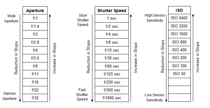
Measuring light in stops is useful because it allows us to compensate these various factors and maintain the same exposure. If I decide to move from f/4 to f/2.8 to gain a shallower depth of field (going up one stop), I can compensate my changing my ISO from 400 to 200 (going down one stop).
Thinking of light in terms of stops can be a bit confusing at first, but it’s really useful for getting – and keeping – proper exposure with your camera. As we start to experiment with different lighting setups, we’re also going to need to make sure that the cameras we use are getting the images we want. That means controlling the exposure.
Light Meters
One of the most valuable tools for getting correct exposure and creating different lighting looks is the light meter. Here’s a short video showing a light meter in action:
https://youtu.be/8lMTUszr6P4
We have two light meters in our equipment collection: a digital meter and an analog meter. The both do the same thing, but you operate them in slightly different ways. Here are video instructions for both:
Terminology
Three Important Points
You’ve probably heard the term “three point lighting” about a million times. It’s often described as a “basic lighting technique,” but I think that description is actually a bit misleading. Saying that three point lighting is a “basic” technique implies that there are more advanced methods that presumable use more lights: say, five point intermediate lighting and seven point advanced lighting. That’s not the case.
Three point lighting isn’t a basic technique, it’s a fundamental technique – the fundamental technique – for lighting a subject. There may be dozens of lights set up for a shot, but the subject (the actor, generally speaking) will still be lit using three point lighting. That’s because three point lighting describes how we see other people every day, with different levels of light and shadow.
When you are outside, you are probably being primarily illuminated by the sun – that makes it the key light. The sun can be a hard or a soft light, depending on the weather and time of day; overcast days are generally considered great for filming, since the light is diffuse and flattering.
Depending on the sun’s location, it will cast shadows on one side of your face or the other, but these shadows are softened by the other lights in the environment: either light from the sun that has been reflected off of other objects or other sources of nearby illumination. These softening lights are the fill.
Finally, there is almost always light coming from behind you – usually either the sky or some reflected light from the sun. If this light overwhelms the light of the sun (the key light), you will be silhouetted; if it is fainter, it will wrap around you from behind as a rim of light. This is the back light.
You don’t need to go far to find this “natural three point lighting” – the next time you are outside, just take some time to look at the patterns of light and shadow on the people around you.
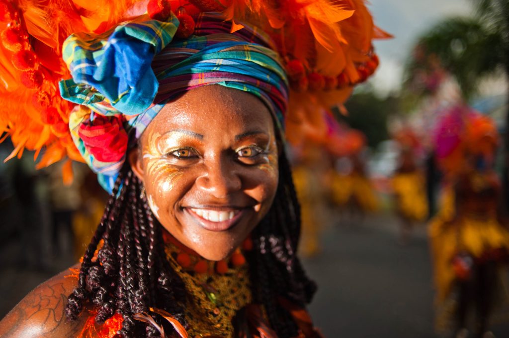

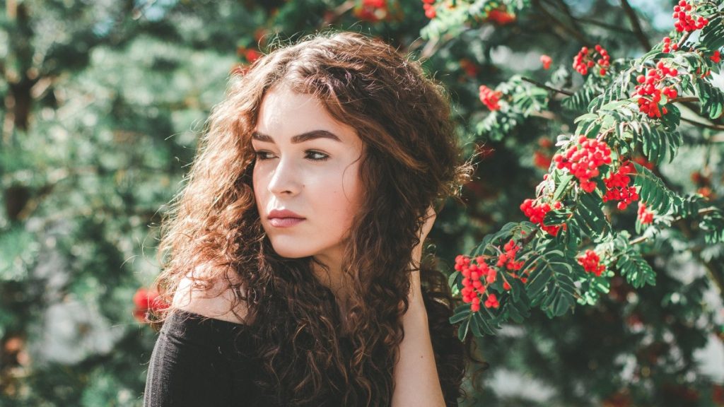
In the studio, we don’t have access to the natural three point illumination of the sun, so we replicate it as best we can. We use a key light to illuminate the face, a fill light to soften the shadows, and a back light to illuminate from behind. This method looks natural because it replicates what we see in nature.
Here’s a video analysis by wolfcrow on how and why three point lighting works:
When you are setting up three point lighting, you have a few factors to consider. How harsh should the shadows be? How intense should the back light be? Which side should the back light be on? These are largely a matter of personal preference and can change from one setup to another. I personally think that the back light looks best on the opposite side from the key, but many lighting diagrams show the opposite. The important thing is to be conscious of how these choices affect your scene.
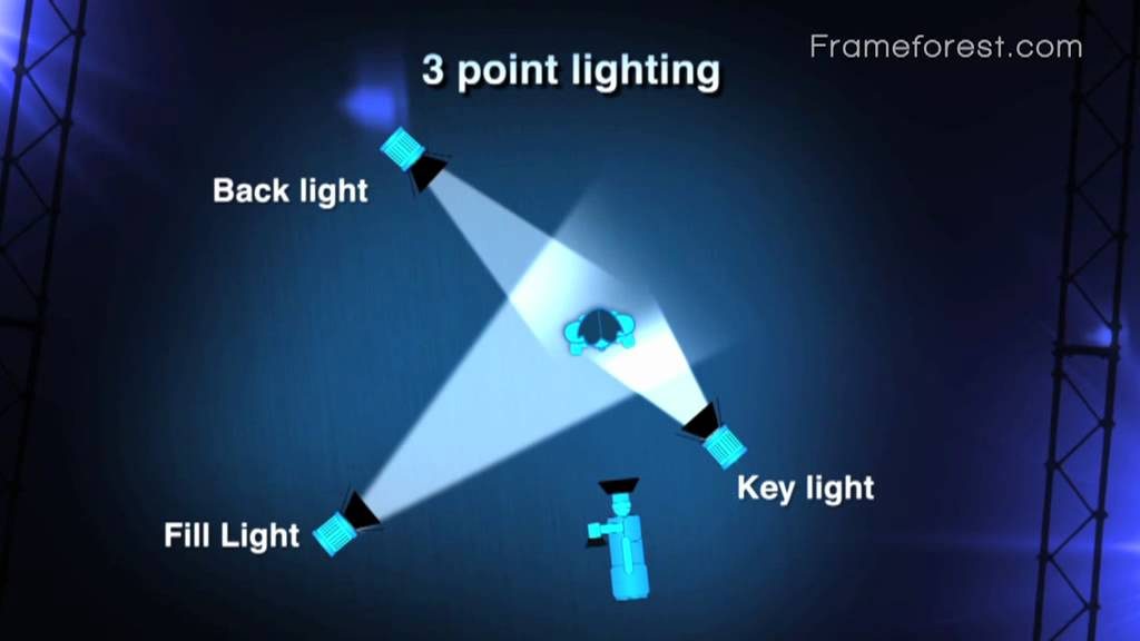
For a very quick overview, here’s a brief video from Full Sail. There are about a million three point lighting tutorials out there, but this one is concise and accurate.
Contrast Ratios
When we talk about contrast ratios, we are generally talking about the ratio of light between the key side and the fill side of a subject’s face. To measure the contrast ratio, you can take a reading with a light meter on the key side with the fill off, then on the fill side with the key off. Here’s another video from light guru wolfcrow about contrast ratios. He has some specific ideas about measuring contrast ratio in aperture stops that I don’t find totally logical, but the general idea is the same.
https://www.youtube.com/watch?v=S_hyiLZiggk
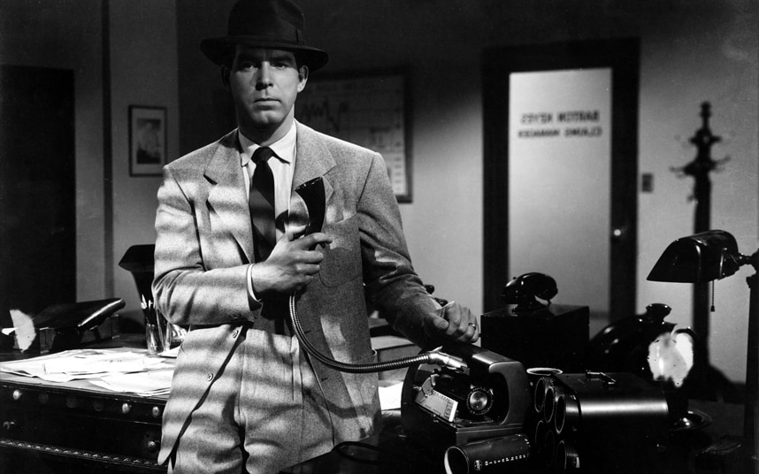
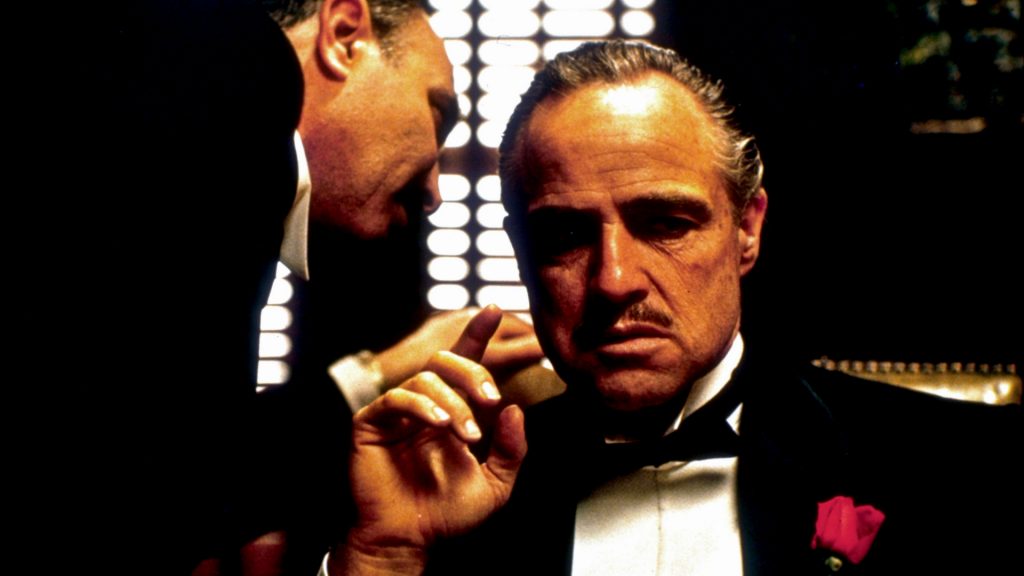
Contact ratio is incredibly important because it can really help establish the mood of a piece. You will often see a high contrast ratio on highly dramatic or tense films. Look at how dark the shadows are on Marlon Brando’s face in this shot from The Godfather.
A low contrast ratio is often used on films that are meant to be lighthearted, such as comedies. Since low contrast lighting is usually flattering, it’s also used on romances. Look at how even the lighting is in this shot from Mean Girls.
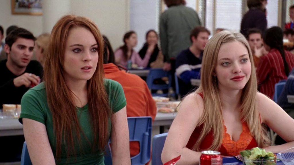
In terms of actual numbers, an average contrast ratio is somewhere around 4:1. In a film with high key lighting, the faces of the actors might be lit with a contrast ratio of 3:1 or 2:1. Ratios lower than 2:1 are not often used, since at that point you start to lose the details of an actor’s facial features. Films with low key lighting might use a contrast ratio of 6:1 or 10:1 or higher – the greater the contrast ratio, the more dramatic the lighting.
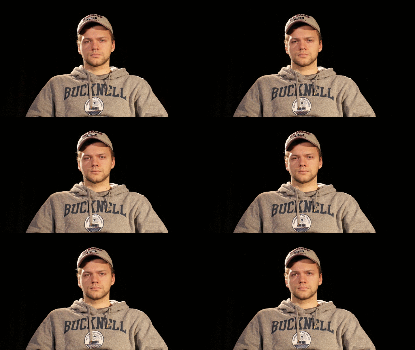
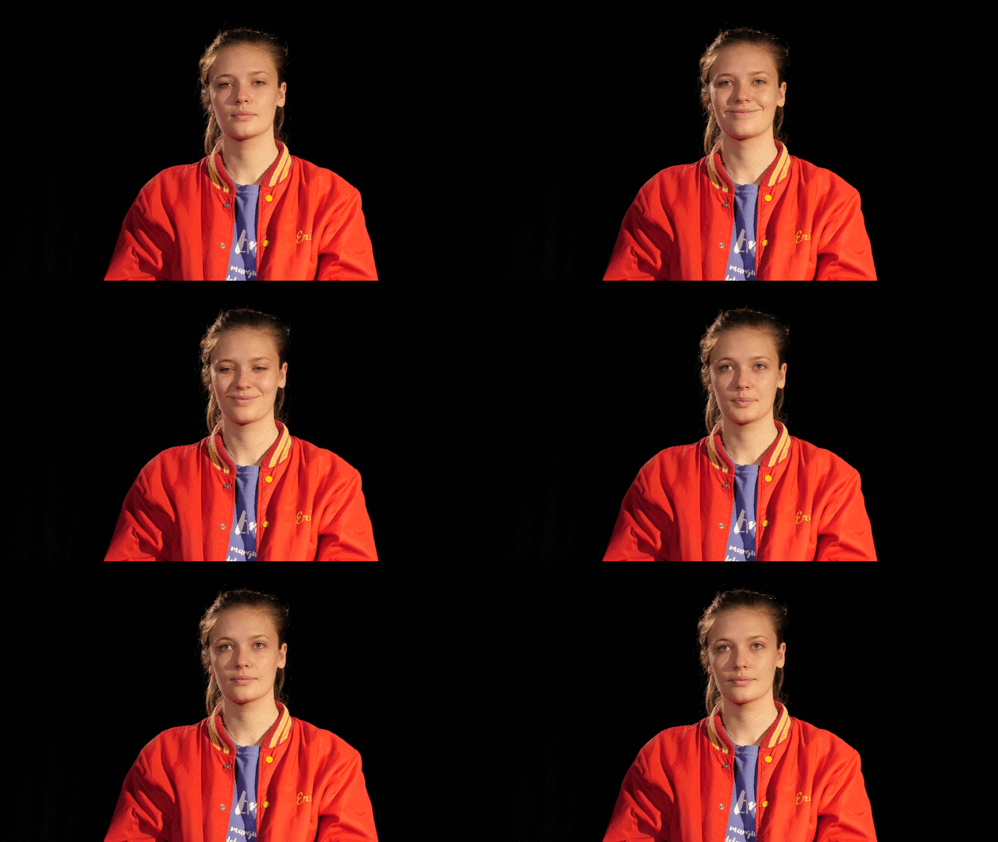
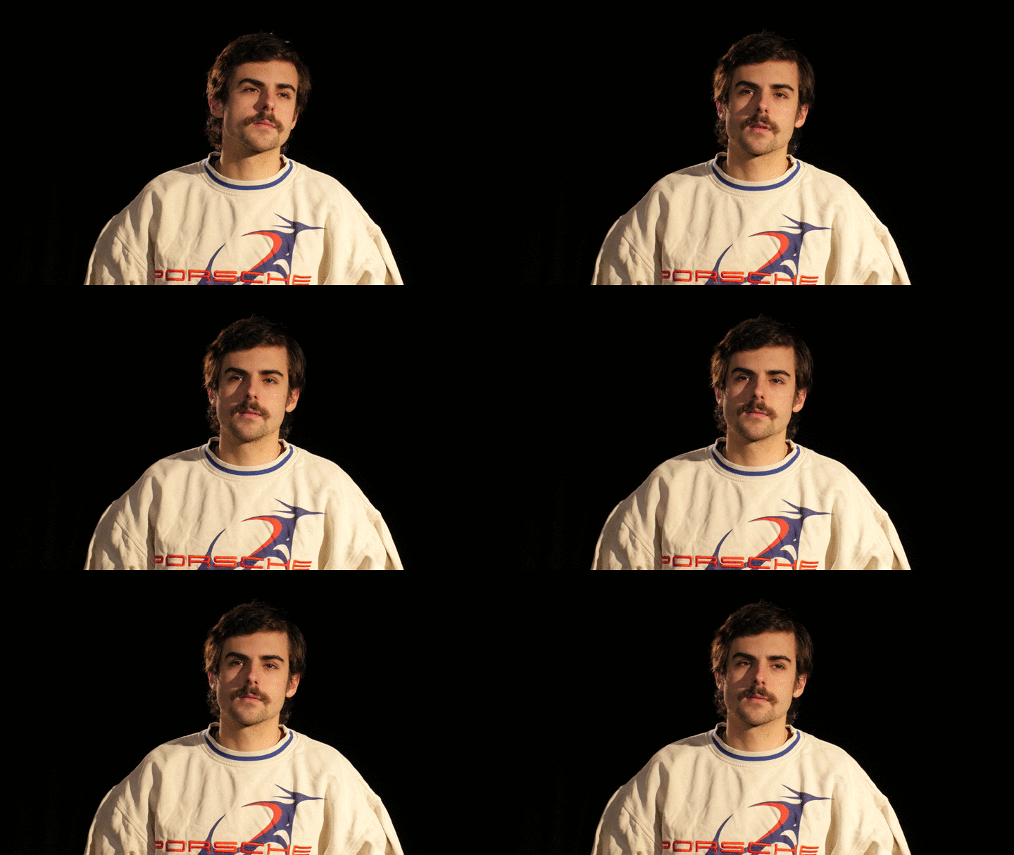
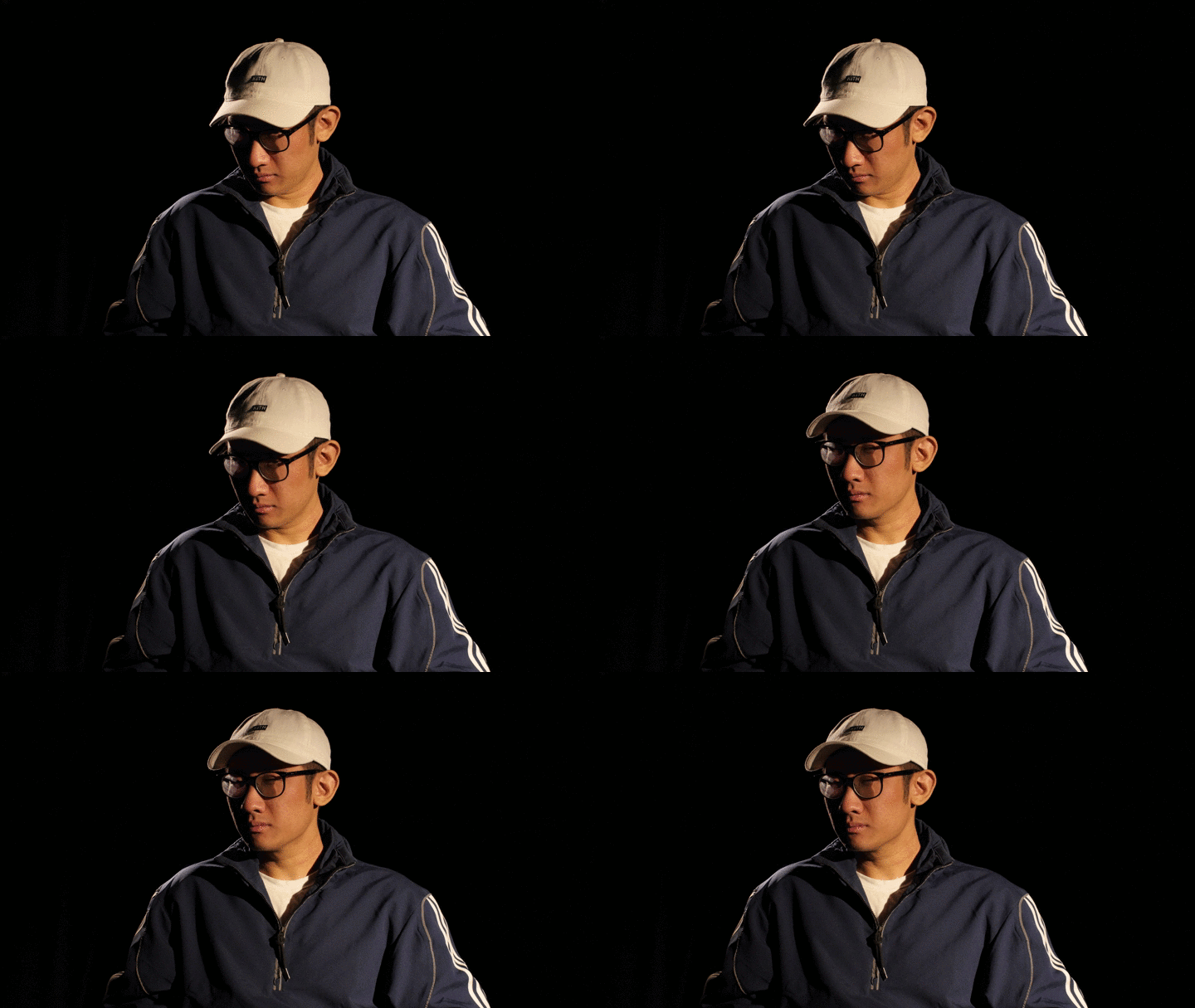
Project 2: Faces In The Dark
For the next project, we are going to work as a group. Set up a key, fill, and back light in front of a black backdrop. Using the same key light, we’ll adjust the fill to create different contrast ratios: low contrast (less than 4:1) for high key shoots, average (around 4:1), and high contrast for low key shoots (greater than 4:1). Everyone should take turns being in front of the camera so that the entire group gets a chance to operate the equipment.
The First Rule of Lighting Is…
You might be surprised by how many movies, television shows, and short films take place in offices. Here’s a quick look at how to recreate some office looks, including the toxic workplace from Fight Club and, of course, the banal-but-ridiculous sitcom setting from The Office.
Max
Casey
Dante
Justin
https://www.youtube.com/watch?v=uE1tqMUd4R8
Alex
Safety First
All film equipment needs to be handled safely, but this is especially important when it comes to lights, since you are dealing with electricity and heat. Here are a few tips for handling lights and lighting equipment.
Types of Lights
Here are the different kinds of lights that you have access to in the F/MS collection.
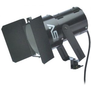
This is probably the simplest light design – it’s just a bulb in a housing. You can use barn doors to manipulate the light, but you can’t adjust the throw, color temperature, or even the brightness. The light produced is sharp and direct – good for creating dramatic shadows. This light will get hot, use gloves.
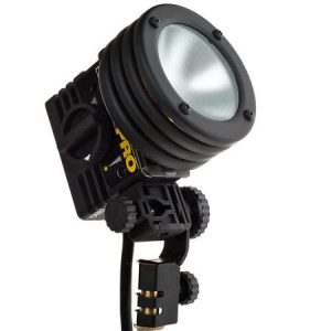
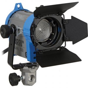
Fresnel lights (the “s” is silent) have a special lens in front of the bulb that allow them to be adjusted from flood to spot. This makes them very flexible – we have lots of fresnel lights in the equipment collection, because they are so versatile. The tungsten fresnels will get hot during use, so use gloves.
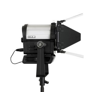
The LED-based fresnel lights in the collection offer the same versatility as the tungsten lights, but they don’t become hot during use. The Inca 4 has a fixed color temperature that should match the tungsten lights, while the much larger Arri L7-C has adjustable color temperature. Both lights can be controlled remotely via DMX.
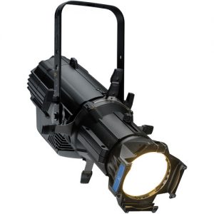
This powerful LED light has a fixed throw of 26 degrees. Lights like these are often used in theatrical productions and can be controlled directly or remotely via DMX. Because it uses LEDs, the light does not become hot during use.
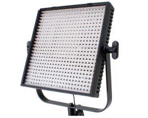
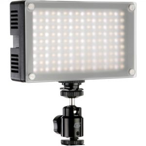
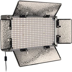
LED panels don’t generally produce as much light output as fresnels or spotlights, but the light they produce is flattering and diffuse. These lights can be battery-powered, which makes them a good choice when portability is important. The larger Lite Panels 1×1 and Genaray SpectroLED have a fixed color temperature – daylight, or 5600K – while the smaller Genaray 7100T can be adjusted. These lights can be handled without gloves.
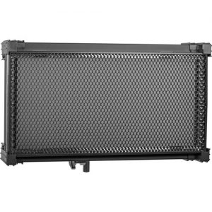
The Kino Flo Celeb is a large, high-quality LED panel with variable color temperature. It produces even, flattering light. At roughly 24 by 14 inches, the Celeb is much larger and heavier than the LED panels made by Genaray or Lite Panels. The Celeb requires external power and can be controlled via DMX. There are also preset controls on the unit itself. This light can be handled without gloves.
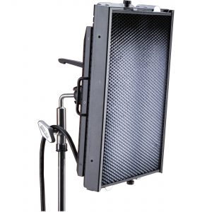
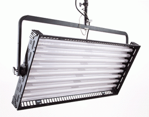
The Kino Flo Barfly and Image 45 are both large fluorescent panels that produce a high output of soft, even light. The size and weight of these lights make transportation challenging, although the Barfly can be loaded into a hard-sided case. If you need to fill a large space with light, these are good options. These light fixtures can generally be handled without gloves, although the bulbs themselves should not be.
Other Equipment
A reflector (or “bounce”) can be used to reflect, diffuse, or block light. Different covers can be put onto the reflector for different effects – generally, white, silver, and gold. Folding reflectors can be a challenge and there are different methods. You can “make a taco,” for example; I prefer to just twist my hands in opposite directions. Give it some practice.
A gel is a piece of colored plastic used to tint a light. When using a gel with a light that becomes hot during use, be sure to keep some distance between the gel and the bulb.
A scrim is a semi-opaque cloth used to diffuse light. It is usually white or black.
A cookie is a small plane that a light shines through, creating a distinct pattern. These can be anything from leaves to window blinds. A gobo is similar to a cookie, but it doesn’t create a distinct pattern – it is simply a plane that is placed between a light and the set to block some of the light’s output.
The Kubrick Effect
Here are a couple of videos that examine the brilliant lighting techniques and cinematography utilized by Stanley Kubrick. The first looks at Kubrick’s use of practical lights and the second delves into his 1975 classic Barry Lyndon.
Welcome!
Welcome to the Spring 2018 session of the Film/Media Studies Production Practicum. This semester’s topic delves into two areas that are crucial to film and video production: lighting and color grading. I’ve chosen to pair these two topics together because they parallel each other in different stages of the production process. Lighting affects the way footage is captured during filming, using a combination of on-set equipment and camera settings; color grading affects the way existing footage is processed during post-production, using either editing software or a dedicated color grading program.
Taken together, lighting and color grading contribute enormously to the overall look of a film. Beyond aesthetic preferences, they can imbue a piece with specific emotions, highlight themes, set moods, serve narrative functions, and much more. While lens choice, camera angle, and shot composition often work in obvious ways, lighting and color grading can work more subtly. When used thoughtfully, they are invaluable artistic tools.
This semester, we’ll spend the first half of the term on lighting: using various techniques and pieces of equipment to shape the look of the footage we capture. We’ll spend the second half of the term manipulating that footage using post-production software such as Premiere Pro and SpeedGrade. By the end of the semester, you should have a powerful collection of cinematic techniques at your disposal – whether you are behind the camera, behind a computer, or both.
Color Temperature
We’re going to be using a few terms quite frequently throughout the semester, so it’s important that we define some things right from the start. One of the most important things that we’re going to be talking about is color temperature.
Put very simply, color temperature is a measure of how “warm” or “cool” a light is, measured in kelvin (K). If you want to really dig into the science behind color temperature, it has to do with the temperature of black-body radiators and lots of complex equations are involved. For a relatively concise and clear summary, check out this excellent video from Filmmaker IQ.
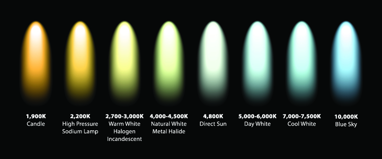
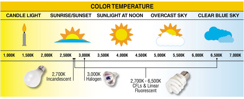
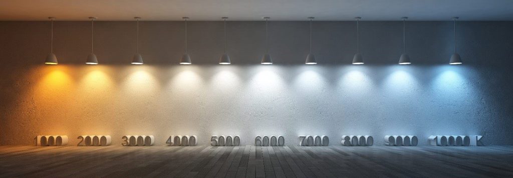
You don’t really need to understand the Newtonian physics of light or Planck’s Law to understand color temperature (although it certainly couldn’t hurt). All you really need to know is that “white” light actually always has a tint to it and that tint is measured in kelvin. Low kelvin light is very orange – candlelight is around 1000K. High kelvin light is very blue – the light from a blue sky on a clear day is around 10,000K.
Different charts will give slightly different values for various light sources, but the general idea is the same across the board.
White Balance
If all white light is actually tinted blue or orange, why don’t we experience the world in those hues? Your brain is actually very good and making adjustments for different color temperatures automatically. For example, if you are in a room lit by incandescent bulbs (which have a yellow cast) and then go outside on a bright, overcast day (which has a blue cast), your eyes will quickly adjust to the changing color temperatures. You probably won’t notice the transition; your brain quickly and automatically compensates.
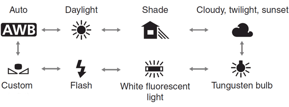
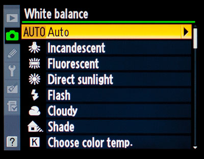
While our brains can go through this process automatically, cameras rely on specific settings. The kelvin value that a camera considers white is called its white balance. If you are using a camera indoors with incandescent lighting, you might set the white balance to 3200K. If you are filming outdoors, you might set the white balance to 5600K.
Obviously, the specifics of setting white balance vary from camera to camera. Most cameras have preset options such as “direct sunlight,” “cloudy,” and “incandescent.” This can be a great place to start, if you want to dial in your white balance quickly. Some cameras include the option to manually set the specific color temperature (in kelvin), which is a more precise option. If you can take the time to set the temperature yourself, that’s generally the best way to do it.
Some cameras allow you to use a white or grey source to set white balance. You can hold a card or piece of paper centered in front of the lens and tell the camera to use that particular shade for “true” white; the camera will adjust things accordingly. This is a good option because it allows you to dial in a setting that is unique to your shooting situation without trying to figure out the kelvin value.
https://youtu.be/48c02L_nHZc
Watts, Lumens, and Lux
We can use degrees kelvin to describe the color of light, but how do we describe how muchlight there is? In other words, how do we measure brightness? This gets a little more complicated, because there are different ways of thinking about brightness. Are you measuring how much light is being produced at the source of the light itself, or a certain distance away, or how much is shining on a surface? Because light can be considered in so many different contexts, there are a number of different ways of quantifying it.
When you buy a lightbulb, you probably look at its wattage to determine how bright it will be; for example, a 100 watt bulb is brighter than a 40 watt bulb. However, wattage is a measure of energy, not brightness. Furthermore, as low-energy LEDs have replaced incandescent bulbs, the relationship between wattage and brightness has changed.
The amount of light being emitted by a source is actually measured in lumens. A lumen measures the amount of photons being emitted through a conical area of 3D space. You will often see watts and lumens used together to describe a light source’s efficiency, or “luminous efficacy.” The higher the lumens per watt (LPW), the more efficient the bulb will be.
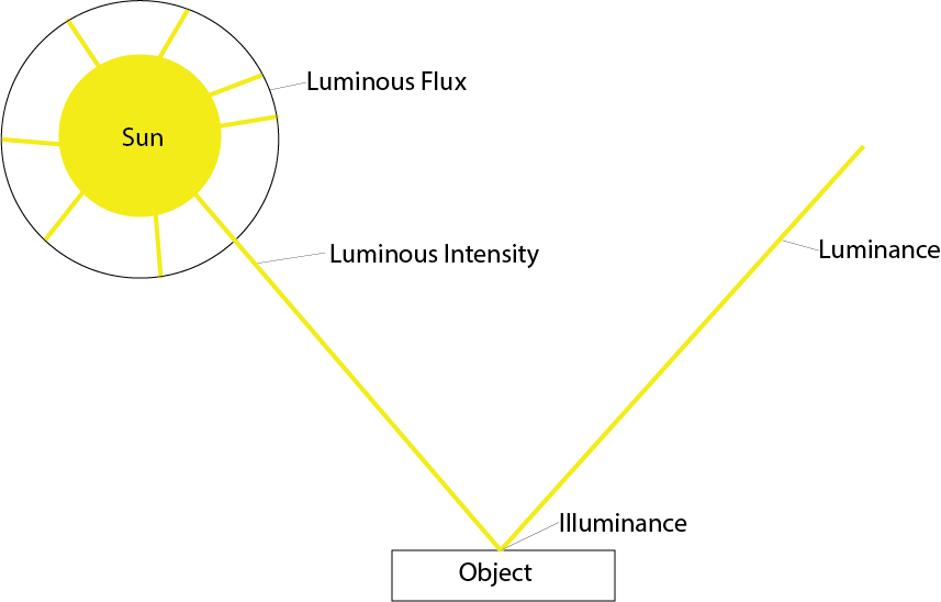
However, for the purposes of getting correct photographic exposure, we use a third unit: lux. Lux measures the amount of lumens in a square meter; this can also be referred to as illuminance. Lux measures the amount of light on the surface being illuminated, rather than at the source of the light – this is what makes it useful for cinematic purposes.
To illustrate, the light in an average office will fall between 300 and 500 lux. Brighter studio lighting could be around 1000 lux. The hour around sunset is around 400 lux and a full moon on a clear night will provide less than a third of one lux.
You may sometimes see illuminance measured in foot-candles, which uses square feet instead of meters. One foot-candle is roughly equal to ten lux. Screens and monitors also have brightness ratings, but since these aren’t meant to illuminate (only to be seen), a different unit is used: the nit. A normal HD television may range between 500 and 1000 nits.
We’ll be primarily using lux to measure light in this class, since that is the unit that will help us help us capture properly exposed footage. If you’d like to get deeper into the technical side of things, check out this article, which dives into the science and math behind measuring light.
Project 1: Light That Moves Us
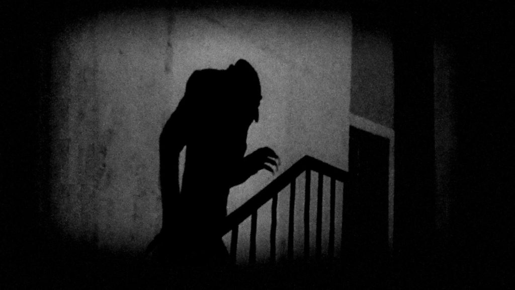
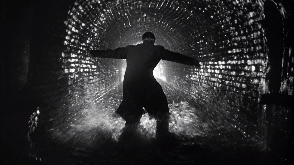
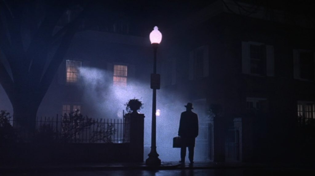
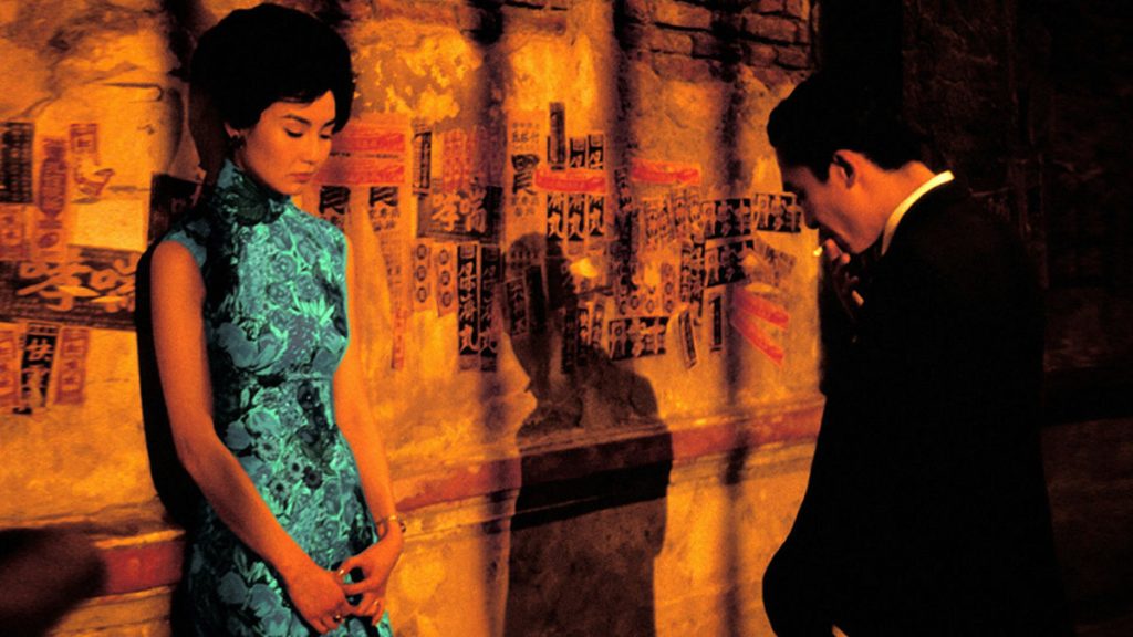
Determining the color temperature and illuminance of a light allows us to describe its characteristics with scientific accuracy, but it can all start to feel a bit sterile. As cinematographers, we want to paint with light, not just describe its wavelength. We’ll build on what we discussed this week in the next lesson as we use light meters and other tools to get proper exposure. In the meantime, I’d like to see some examples of lighting that you find interesting.
Drawing from movies, television, or short films, I’d like you to send me two examples of lighting that grabs your attention. Don’t worry about the technical aspects too much – instead, focus on the emotional or narrative effects of the lighting in the scene. Send me a still image (or a clip, if you can find one) and a short sentence or two about why you chose that particular shot.
Here are a few of my favorites: Nosferatu, The Third Man, The Exorcist, In the Mood for Love, and Skyfall.
